The New Workplace Experiences That People Crave
Employees want to move past the corporate workplace experience to more creative, natural, and residential environments.
Note: This is the fourth blog of a series unpacking the detailed findings of Gensler’s Global Workplace Survey 2025. Read part one here, part two here, and part three here.
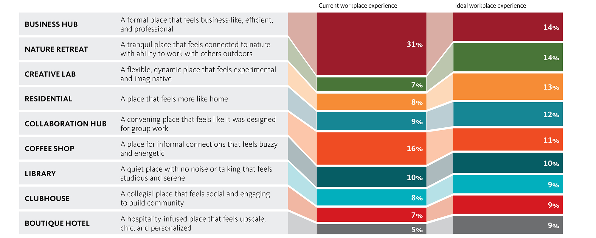
Today’s workers don’t want the same traditional corporate workplace that’s been in place for decades; they’re craving new experiences. According to our new Global Workplace Survey 2025, just 14% of the global workforce desires a traditional corporate workplace experience. In Gensler’s latest workplace research, which surveyed nearly 17,000 full-time office workers across 15 countries and 10 industries, we explored what best describes workers’ current and ideal workplace experiences. Workers reported a desired shift from corporate experiences like business or collaboration hubs to nature retreats, creative labs, and residential experiences.
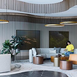
Employees want to move past the corporate workplace experience and business-like settings to natural, creative, and residential environments. People desire tranquil experiences that feel connected to nature, with the ability to work outdoors, and dynamic experiences that feel experiential and imaginative. Spaces that cater to making connections, support productivity, and enhance well-being are important to employees, both on-site and near the workplace.
Amenities are an important part of the experience within the workplace. Below are the relative ranking of the spaces employees selected as most important to have beyond their individual workplace and meeting rooms. (Source: Gensler Workplace Survey 2025.)
- Café, Market/Food hall
- Work café/Coworking area
- Lounge/Hub
- Rest/Nap space
- Quiet/Deep focus area
- Focus room
- Outdoor workspace
- Phone/Video room
- Library
- Fitness area/Well-being center
- Project/Dedicated team room
- Innovation hub
- Immersive technology space
- Reflection/Meditation space
- Tech-free area
- Touchdown/Alternative individual workspace
Ideal Experiences Vary
Ideal experiences vary by industry. While industries like financial services, legal, and government still prefer business-like environments, other industries, like sciences and media, prefer creative lab experiences, which feel experimental and imaginative. Nature retreat experiences, which feel connected to nature with the ability to work with others outdoors, were most preferred by Consumer Goods workers, and came in a close second for most industries. In contrast, Not-for-Profit organizations ranked residential experiences as their ideal choice.
One surprise? There were only slight differences by age, with rankings and percentages more consistent than different. Despite generational differences in how people work and what they value, the workplace experiences that people crave are more universal across ages.
Workplace Experiences in Practice
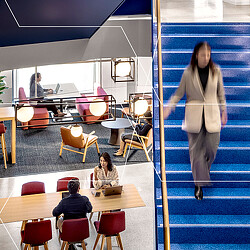
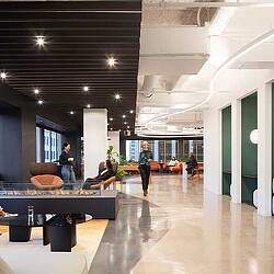
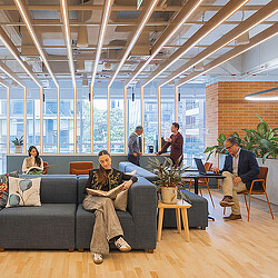
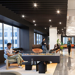
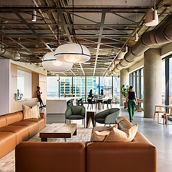
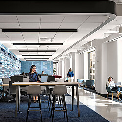
Many of our clients want to provide a mix of experiences for their employees. They view their workplace as more than just a place to work, but as a compelling destination that provides a variety of spaces and experiences for employees to work alone, collaborate with others, and to build relationships.
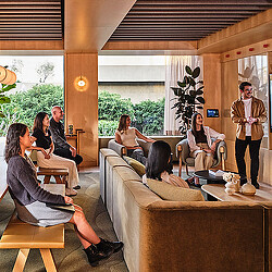
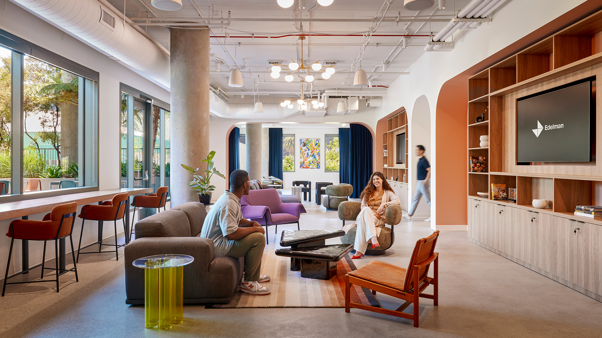
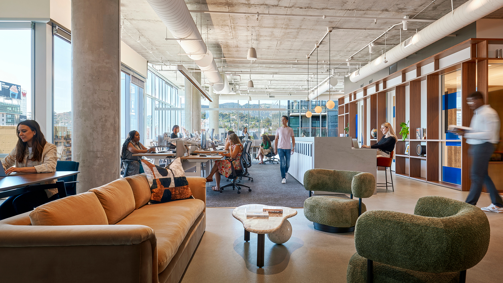
For example, Edelman’s Los Angeles office combines hospitality, social gathering, and flexible work environments in a setting designed to feel more like a vintage social club than a traditional corporate space — complete with a ground-floor café that can easily convert into a bar or event venue, creating an authentic sense of choice and connection.
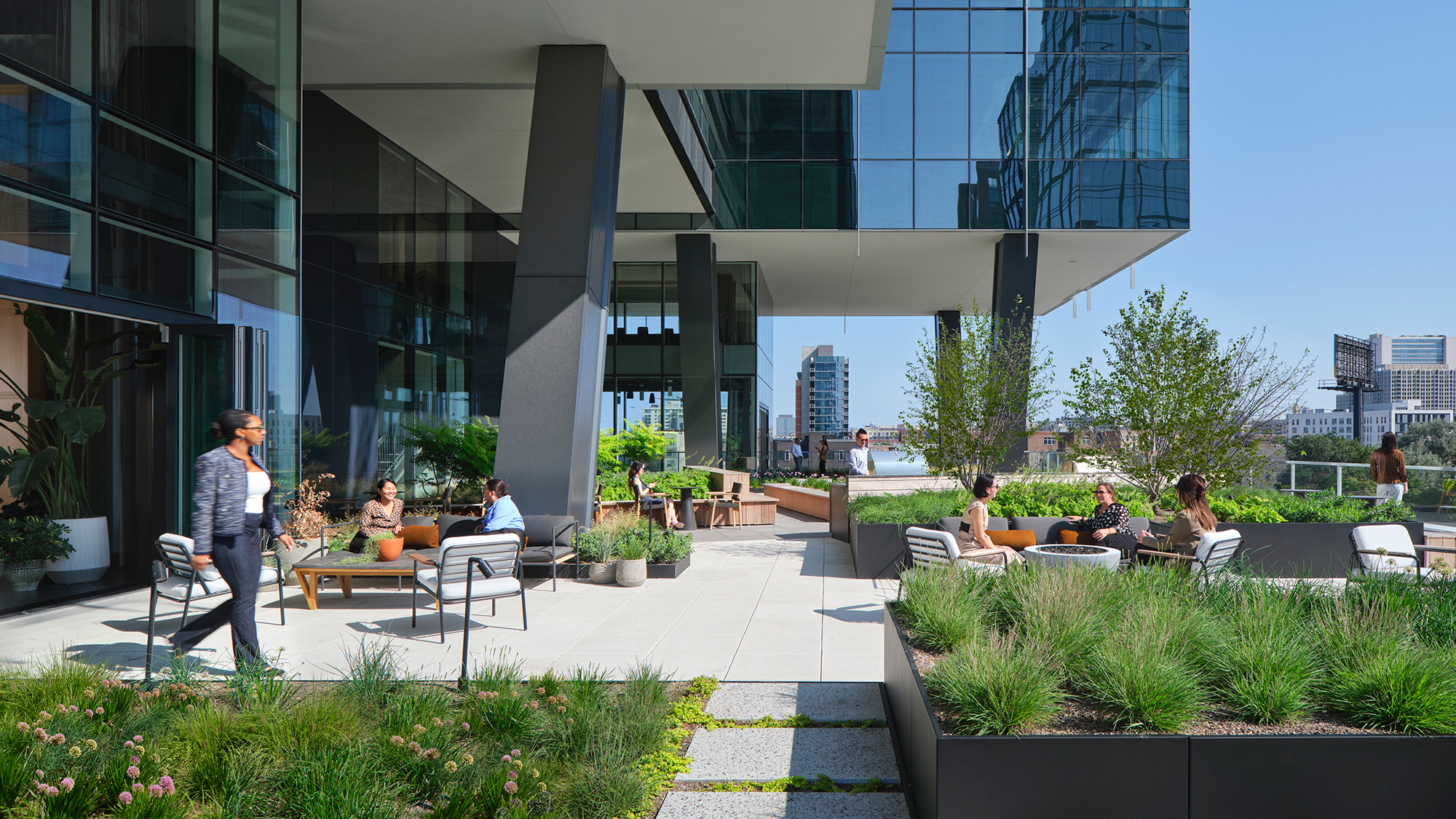
At 360 N Green in Chicago, a next-generation commercial building integrates hospitality, leisure, and work across its amenity floors. It offers tenants flexible lounges, outdoor terraces, a speakeasy-inspired gathering space, and conference environments that mirror the sophistication of professional firms without feeling cold or corporate.
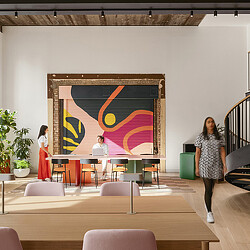
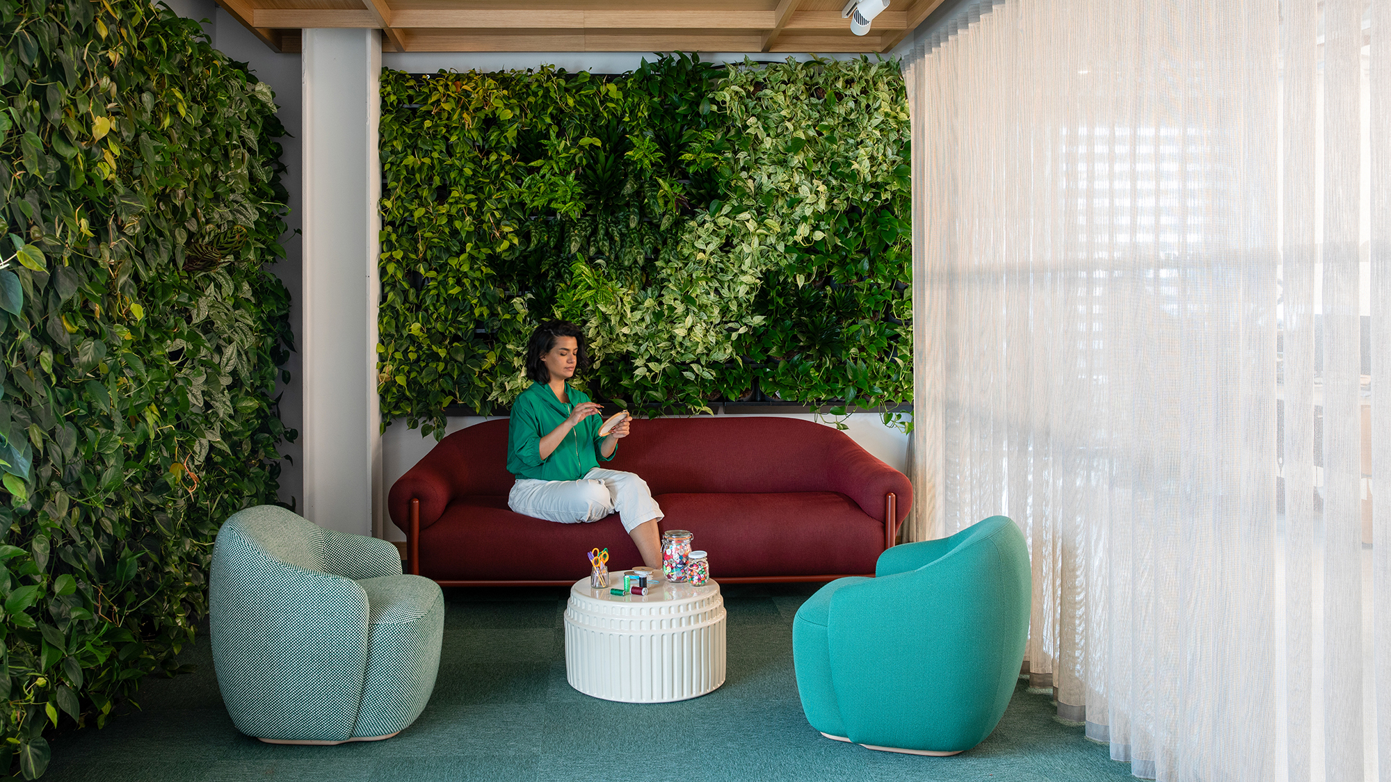
At Etsy’s Dublin office, we partnered with the brand to create a community-driven, craftsmanship-centered hub that integrates local artisan work, biophilic design, and highly adaptable spaces that flex for hybrid working needs. Etsy’s workplace fosters a sense of identity, belonging, and emotional attachment, supporting its people and mission by embedding elements of local culture, sustainability, and sensory well-being.
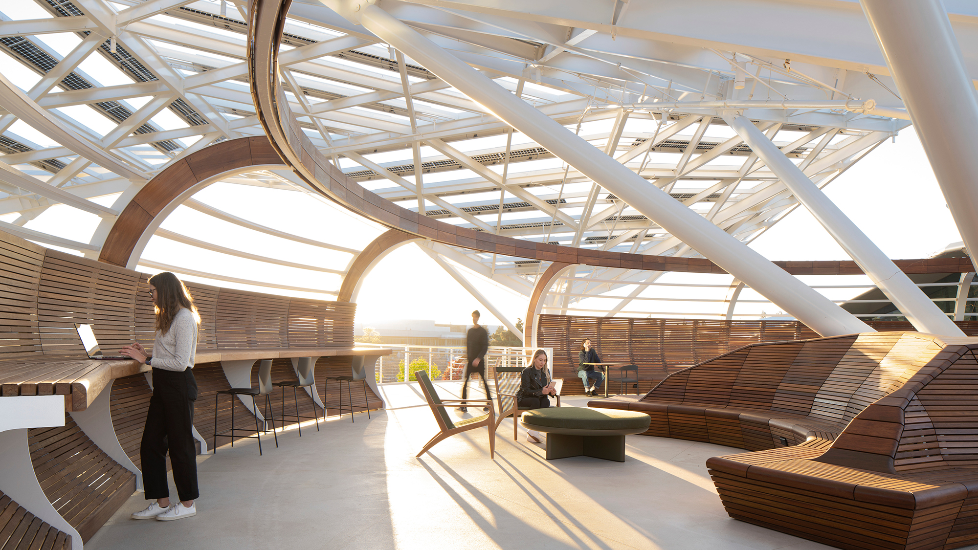
At NVIDIA’s campus in Santa Clara, California, the design creates ample space for employees to comfortably work outdoors with parks and “treehouses” for impromptu interactions and other gatherings, while also bringing nature into the indoor environment to facilitate creative thinking and make employees feel like they’re working outdoors.
Desired Experiences Are Not Limited to New Buildings
Mitigating unwanted noise and providing access to fresh air, daylight, and views to the outside should be considered table stakes in the design or retrofit of all workplaces. While older buildings and/or existing spaces may pose architectural limitations, low-cost or no-cost ways exist to provide some of these experiences.
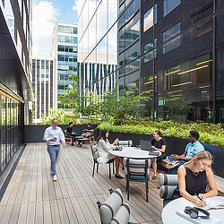
Employers can connect employees to nature by activating terraces or rooftops equipped with Wi-Fi and ergonomic furniture for teams to work, and by creating calming indoor gardens or biophilia zones with plants and natural sunlight with outside views. Employers can inspire new ways of working or idea prototyping by creating areas with modular furniture, flexible lighting, and an array of technology that can be easily rearranged, and by providing writable walls for idea sharing and prototyping tools/materials for hands-on experimentation and rapid iteration. Not all ideas require design or construction. Encourage employees to meet outside at a local coffee shop, a nearby park, or have a walking meeting around the block.
Providing a Great Workplace Experience is Good Business
In our latest Global Workplace Survey, we found that employees with a great workplace experience are five times more likely to experiment with new ways of working, four times more likely to report having fun at work, and twice as likely to feel proud of their company and recommend it as a great place to work.
While we can’t publicly share individual client outcomes, we’ve seen firsthand how intentional, human-centered design can dramatically improve engagement, adaptability, and community-building within organizations, including Gensler’s recently transformed San Francisco and Washington, D.C. offices.
The value of the workplace goes beyond work — it’s a place for employees to come together for a shared purpose. Employers should engage employees to identify what experiences matter most and co-create them together.
When employees are given spaces that feel personal, flexible, and emotionally resonant — whether that means nature retreats, creative labs, or hospitality-inspired environments — it strengthens not just satisfaction but also long-term engagement, innovation, pride, and loyalty.
For media inquiries, email .
