Verbal Identity Is Key to More Inclusive Brand Storytelling
November 15, 2023 | By Collin Peters
There’s a question that’s often asked in brand positioning workshops: “If this brand were a person, how would you describe it to a friend?” Strategists and designers closely familiar with a brand’s DNA might have an immediate answer. But the average person might need time to consider some follow-up questions: how does this brand present itself to the world? How does it communicate with me? What’s its overall vibe?
The answers to these questions are informed by brand identity, a critical foundation of brand design that positions faceless organizations into human-like personalities that can engage, inspire, and connect with the world around them. A well-defined brand identity provides a rich canvas for storytelling, surrounds brand narratives with cues and context, and creates connection between the values a brand promises and the experiences it offers.
When it comes to unpacking the pieces of a brand’s identity, though, there’s usually more than meets the eye. Beyond visual identity elements like colors and typefaces, brand identity also consists of an important verbal complement: verbal identity. Defined as “the articulation of your brand through the use of distinct and focused language expressed through words,” verbal identity is a less discussed but equally important counterpart to visual identity that creates more ways for more types of people to experience brands and their stories.
Verbal identity’s inclusive power is especially impactful among those with different thinking types. Just as visual thinkers differ from verbal thinkers in how they imagine objects or work through problems, they also differ in how they absorb and interpret brand messages and cues. For one person entering a space, a simple logo might conjure up an understanding of a brand’s presence. For another person, a brand's written name or tagline could have the same effect. And for a third person, a measured balance of the two might be necessary to fully prime them for the experience that lies ahead. While visual language may appeal to some types and verbal language may appeal to others, the inclusion of both makes sure everyone has an equitable opportunity to engage.
As our awareness of neurodiversity continues to expand and inclusive design remains a priority, verbal identity — paired strategically with visual identity — is emerging as an equalizer that creates balance, deepens accessibility, and drives a more inclusive brand experience for any type of space and user.
Visual identity expresses brand; verbal identity defines it.
Brands can express themselves visually across an infinite range of canvases within the built space. Everything from a corporate logo behind a reception desk to a large-scale graphic installation spanning multiple floors represents a design team’s unique expression of a brand’s visual identity.
But with different types of thinkers for whom brand recall is a challenge — or new users who haven’t been introduced to a brand at all — visual identity alone isn't enough to convey a brand story. In these instances, verbal identity can step in to facilitate a proper introduction.
In public-facing contexts, verbal identity can use precise language to articulate a brand’s promise or perspective, helping to educate new audiences or refreshing the memories of existing ones. Behind the scenes, verbal identity also creates a foundation for brand standards, which outline critical do’s and don'ts for brand expression. Verbal elements like vocabulary, tone, and stylization can all be incorporated into standards to capture personality and add texture to a brand’s ethos. Over time, these guidelines can serve as a “roadmap” that anyone can follow to ensure brand foundations remain consistent (even when applications don’t) so that brand expression is always informed by a singular, centralized, and consistent starting point.
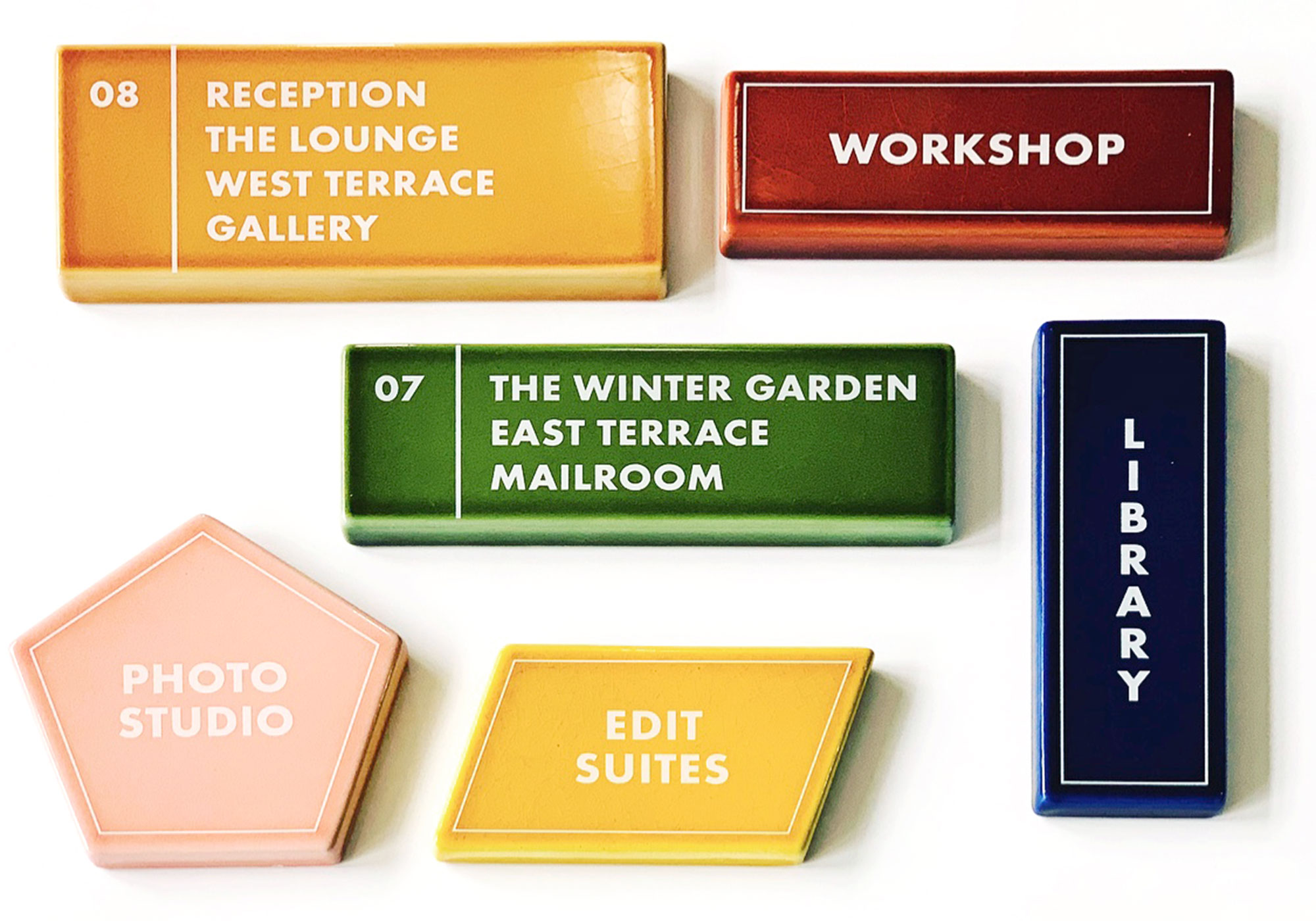
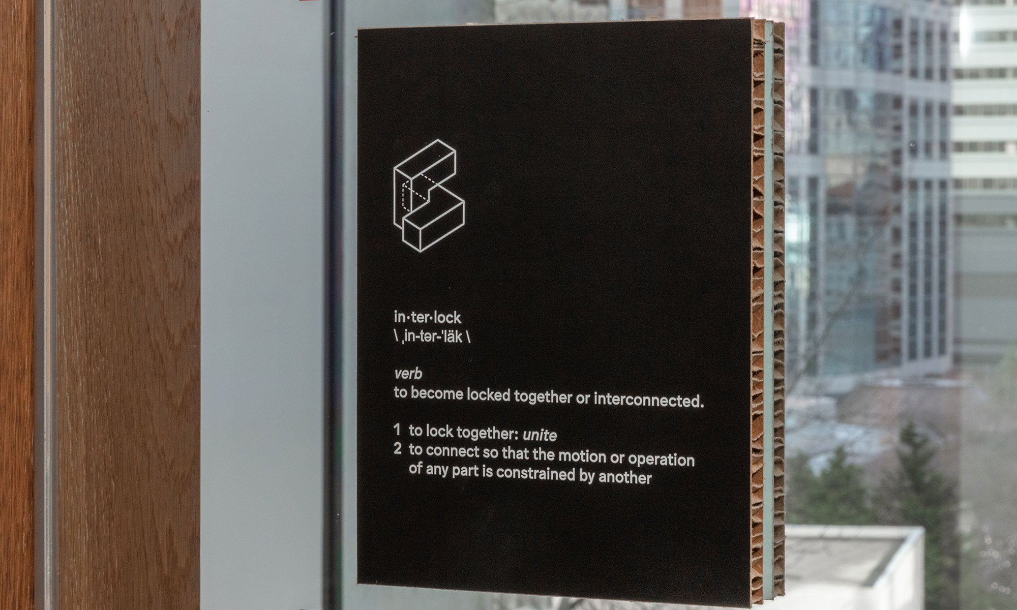
Visual identity tells abstract stories; verbal identity tells concrete ones.
When it comes to brand storytelling, visual design takes an artful and immersive approach. It leans into brand elements like color, shape, and imagery to fill a space with graphics that allude to a brand’s unique story. But these allusions are, by definition, abstract: not only do they leave interpretation up to the users of the space, they also leave potential for some brand stories to be misunderstood or left untold.
For those who need more logical, straightforward explanations, a strong verbal identity bridges this gap and creates opportunities for more concrete storytelling. Brand language can add context around the significance of a particular artifact or landmark that might otherwise be missed. It can ground users in critical history about the space they’re walking through or the meeting room they’re working from. Applied more extensively, it can even guide visitors or clients through a comprehensive, exhibit-like retelling of a brand’s story, from its past through to its present. Regardless of how it’s applied, or to what extent, a strategically leveraged verbal identity can anchor and complement visual design to support a clear, compelling, and holistically accessible story.
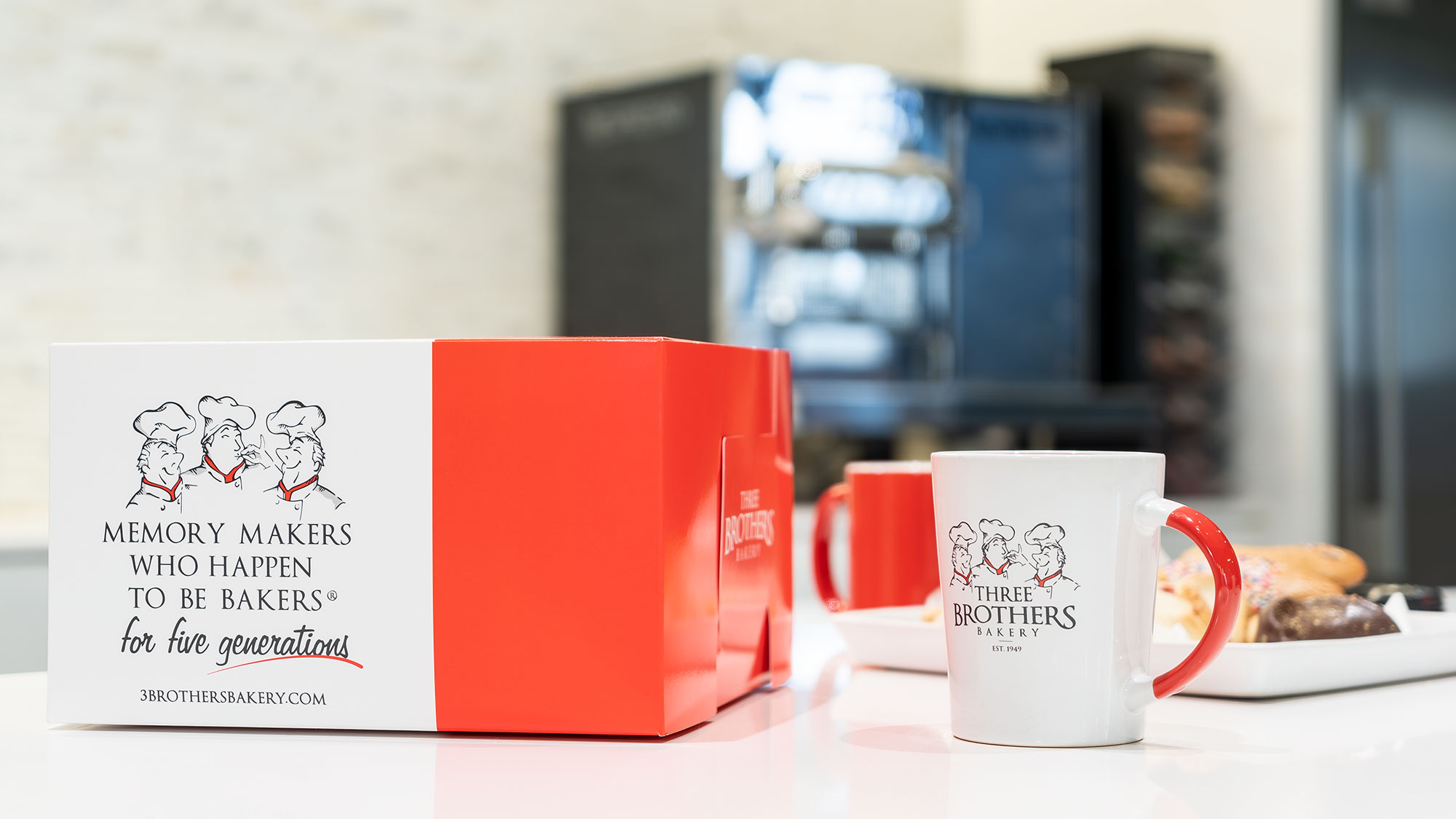
Visual identity inserts cues; verbal identity drives communication.
When it comes to signage, wayfinding, and communication, visual brand design relies on well-placed cues that help users find their place. A wall-mounted arrow in an airport restroom can nudge travelers toward the proper route of travel. A stair icon next to a closed door can guide employees toward the nearest emergency exit. More abstractly, a room bursting with bright color and mosaic tile patterns can signal that a space is meant for creative ideation.
In certain cases, though, a space — and certain groups of users that inhabit it — may benefit from more explicit communication in place of implicit cues. Take a quiet room in a lively startup incubator, for example. Its signage needs to communicate a singular message (no talking allowed!) without invalidating the otherwise innovative and easygoing nature of the larger brand experience. In these situations, verbal identity can play an important balancing act by helping to communicate the policy in no uncertain terms (Keep this space quiet…) while surrounding that same policy with a tone that aligns with brand personality (…but make sure your brain is loud). This verbal approach, combined with familiar brand visuals and typography, effectively communicates the policy, ensures the brand experience remains intact, and opens interpretation and delight to a wider range of users and thinking types.
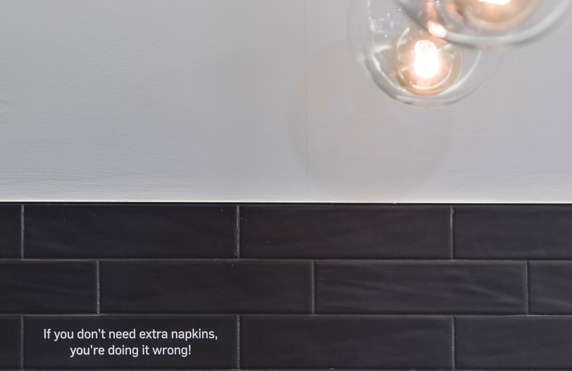
Visual identity can be seen; verbal identity can be absorbed.
Visual identity, in spite of all its benefits, has one major shortcoming: accessibility. Employees, visitors, or customers who are blind or have low vision will have a different experience with purely visual brand elements, and may not be able to interpret stories in the same way as those who are sighted.
To this end, verbal identity once again provides useful (and inclusive!) balance, allowing brand storytelling to be interpreted, experienced, and understood by more users of a space. Signage copy can be printed in tactile Braille or translated to other languages. Phonetic spellings can be included alongside unique names and proper nouns. Text descriptions can be placed beside visual installations. And audio can be recorded — with brand-crafted language — to complement visual exhibits.
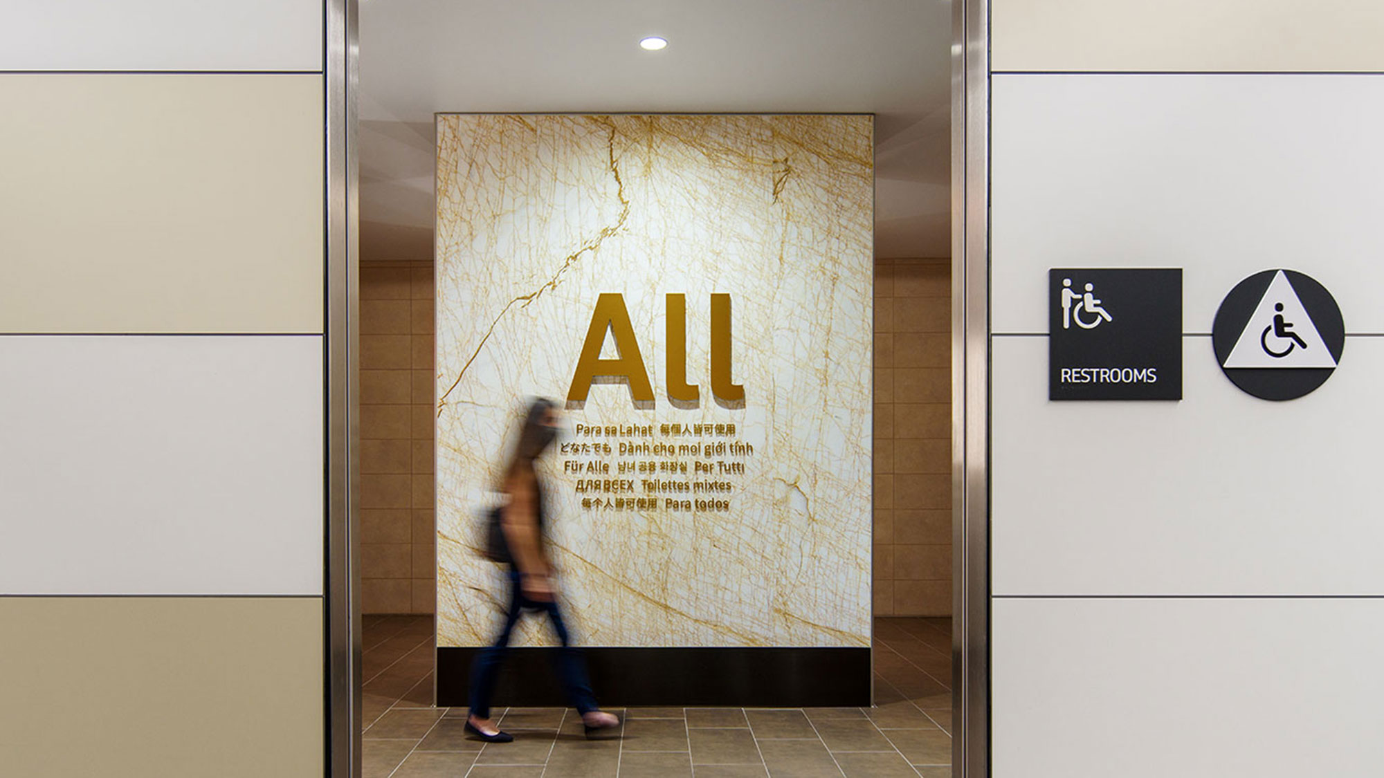
With so many types of employees, customers, visitors, and thinkers to engage, design is tasked with meeting them where they are to ensure experiential equity. Through this lens of inclusive design, verbal identity will play an increasingly important role in informing brand expression that diversifies and equalizes brand experience for everyone.
For media inquiries, email .
