A Living Lab: How the Gensler Phoenix Redesign Supports Our New Work Styles
April 12, 2023 | By James Bailey
At the beginning of 2020, the Gensler Phoenix office set out to design a Living Lab workplace model that would support flexibility for seamless collaboration and innovation. This style of working came from analysis and implementation of Gensler’s Workplace Performance Index conducted to generate a creative and effective approach.
The renovation took place over the pandemic lockdown, and now, with the team fully utilizing the office, we’ve seen how the Living Lab model helps optimize our workflow, drives collaboration, and represents our new, post-pandemic office culture.
A Space for a “Choose Your Own Adventure” Style of Working
The theme of our design has been flexibility. It’s inherent to our strategy of a day-to-day “choose your own adventure” style of work. Our office program is completely unassigned desks, providing a freedom of movement for each person. From a collaborative perspective, it has allowed our teams to congregate and cluster in a variety of ways.
The office has started to develop shorthand for the different physical configurations we form as teams. One of my teams will sometimes decide that it’s a “power bar” formation day — which means we’ll reserve five workstations in a single row. We have our project manager at one end, our project architect at the other end, and our designers filling the middle workstations. This physical alignment supports a mental alignment and cohesive energy with this specific group for this specific day. Since many people work on several projects at one time, this physical reconfiguring helps us to mentally realign with a new project team on different days.
This adoption of choice-driven desking is something that accelerated due to the pandemic. When our firm went remote in March 2020, we didn’t take our belongings home — we just had our technology. And with that, people realized they could do a lot with less. When we’re in the office, we’re now more apt to leverage our lockers for our personal belongings. People are adopting more positive digital habits, like taking digital notes, which allow for greater transparency across team and enhances communication.
With less accumulation of physical things, we’ve noticed that our office feels clean, airy, and refreshed. I’m intentional about what I bring with me to the office, and there’s a feeling of renewal when I walk in the door. Each day is a blank slate, with none of the baggage from the previous day.
Flexibility in Multiuse Spaces
When we conducted our occupancy survey, we realized that spaces were primarily used for collaboration with teams of six or under. This informed our design to emphasize small group collaboration and individual focus spaces. One of our building amenities was a conference center, which included a board room and training center, so we decided to leverage that space for larger group events, like trainings or all-staff meetings.
The building is being repositioned, and we no longer have access to that amenity. But because we had a focus on flexibility built into our Living Lab design model, we have been able to absorb that programming and accommodate larger groups on the fly.
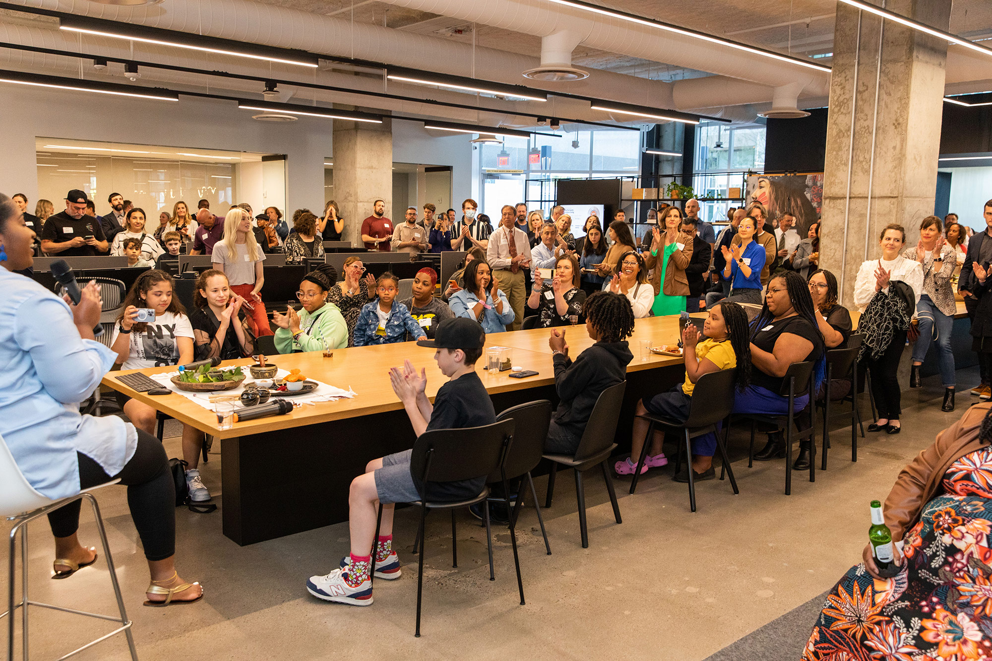
Our materials library, for example, has become one of those workhorse spaces that can meet the needs of an all-staff meeting. While a conventional materials library wouldn’t have this capacity, we had already invested in technology, power, and manipulatable furniture in this space, allowing it to have incredible flexibility.
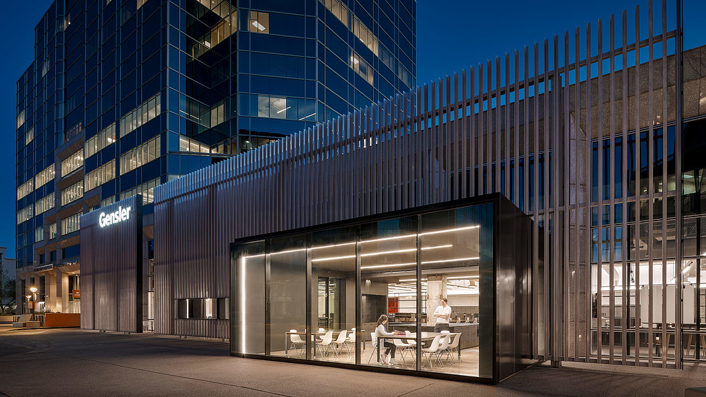
We also leverage our “Match Box” space for large groups. The Match Box physically slots out from the building, like a match box, extending out towards the street and facing the public. We intentionally used clear glass to create a literal window and open the space to community connection. So far, we’ve been using this space for speaker panels, classes, and community presentations. It’s flexible for a variety of event types and is a more casual venue compared to a traditional boardroom.
An area we call the “Dinner Table” is another space with multiple functions. The center focus of the studio, the design intent was to ensure greater accessibility to office leadership, who often use the table instead of a private office. And to that end, we have seen it become the true heart of the office. The Dinner Table has technology built in, so it’s used for hybrid, stakeholder, and client meetings. But it’s also a casual space where our community congregates, where we have learning lunches and charettes, and where we break bread and have community event days. The name Dinner Table developed out of these community experiences and is a continuation of our new community sub-language.
A Reservoir of Culture
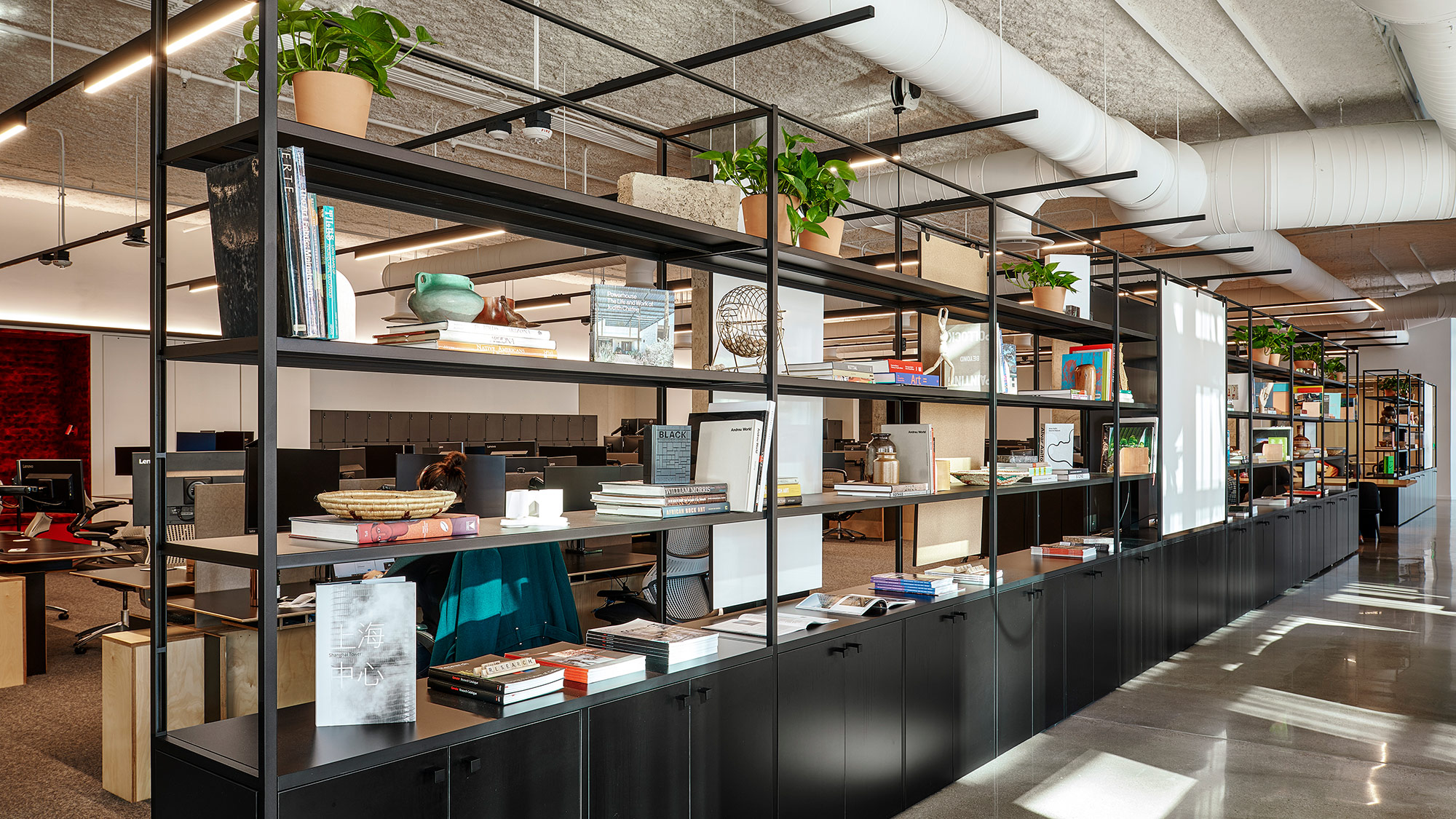
Leveraging our in-house product design resources, a shelving system acts as a divider between the client promenade and workspace. Our styling team has taken advantage of the duality of this shelf, allowing it to be more solid in some areas and open in others.
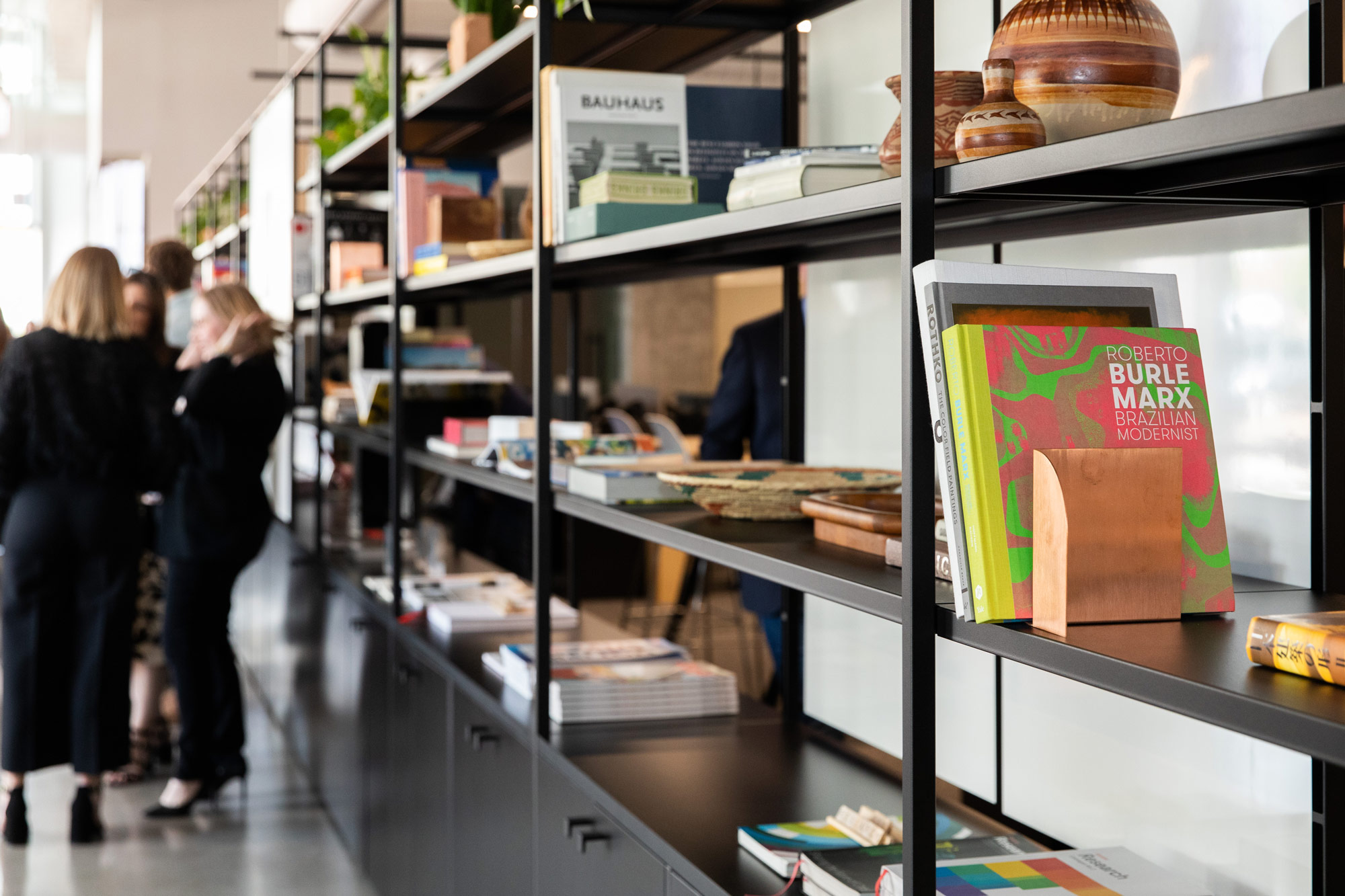
To start, the team found local artifacts and found objects to display as analog inspiration. This naturally led to colleagues wanting to contribute to the library. Now, as employees are on-boarded, they are asked to contribute a book — a physical gesture that has become a cultural signifier, welcoming this person who has become a part of our team. Likewise, our design directors have each chosen a periodical they feel expresses their point-of-view and resonates with their studio, and several of our clients have asked to contribute to this library as well. It’s become an amazing reservoir of our office culture, representing us as individuals coming together to form a diverse design community.
For media inquiries, email .
