Design as a Superpower in the Senior Living Industry
Excellent design of senior living facilities prioritizes well-being in ways that should be automatic for all types of design.
Editor’s note: This blog was originally published in the Open Access Journal of Gerontology & Geriatric Medicine.
Senior living distills the relationship between well-being and design in such a compelling way. When a project provides older adults with access to nature, that is more than just a nice feature; it creates measurable health benefits at a stage in life when they are most consequential. When a bathroom supports individuals of all abilities without sacrificing beauty, that does more than check off a code requirement; it advances human dignity.
Here are three simple tools that can be utilized to unlock the superpower of design. You too can bring the power of design into your organization and positively impact resident and staff experiences.
Design superpower #1 - Design from the inside out
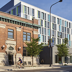
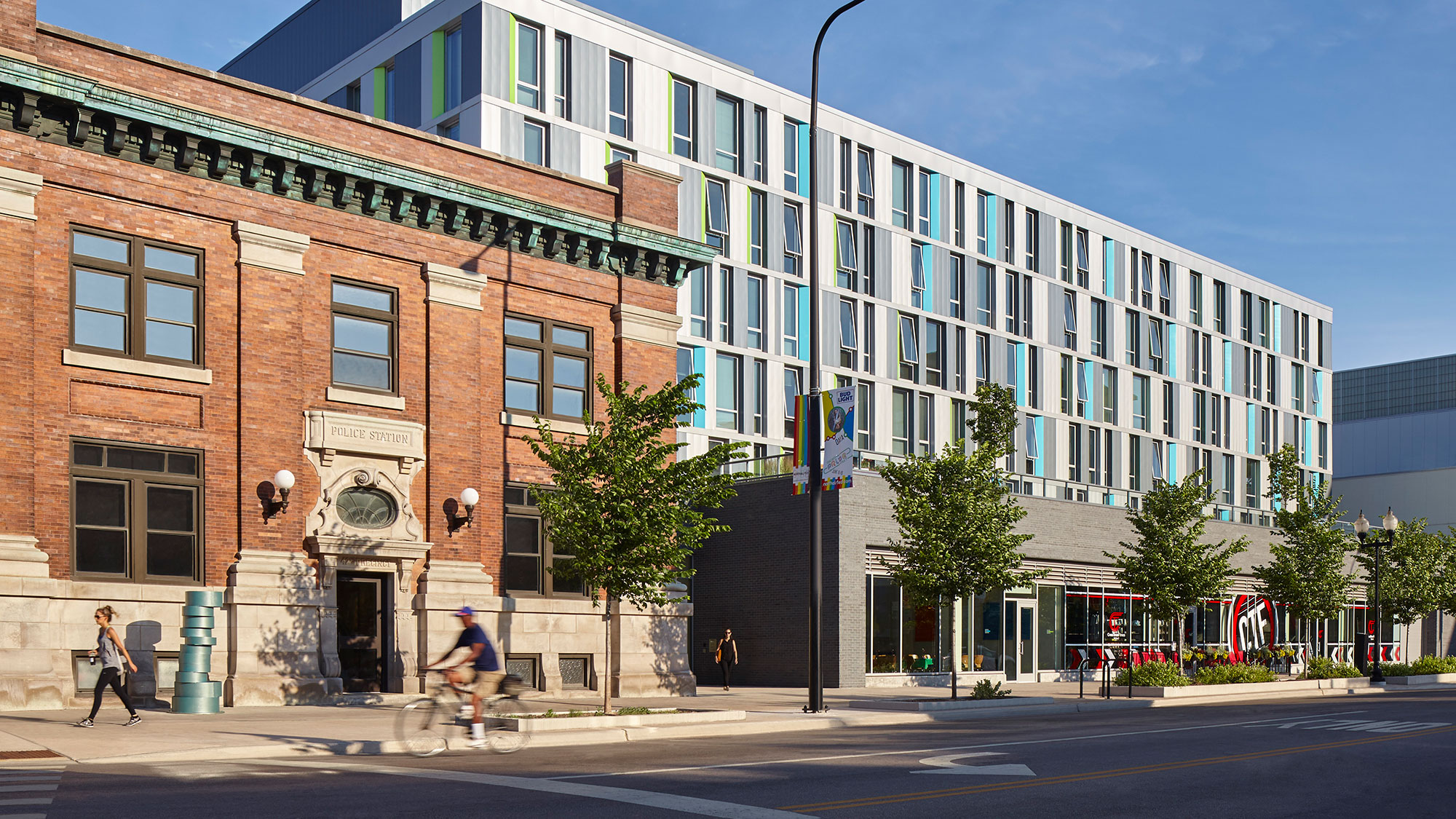
For me, this seems so logical. Design from the inside out; after all, we’re designing for people. Here are two successful examples. Eight years ago, we embarked on one of the first-of-its-kind, an affordable housing project for LGBTQ elders in Chicago, called the Town Hall Apartments. At that time there were no precedents, so we began to unpack the program requirements by talking to the elders themselves — designing from the inside out — defining the user experience. We asked the elders many questions about the possibilities of this project, a place that would become their home. We heard about the importance of this project — it needed to be inclusive, to represent activism, their families, and the concept of new lifestyles. Through a series of workshops, we asked them to think about space and scale, we gave them plans with to-scale furnishings they could move around. In another workshop, we drew on the floor a full-size layout of an apartment so they could test being in the space, seeing the door locations and kitchen location. They assisted the team in determining the size of the apartments and requested that the kitchen be moved toward the exterior window — near daylight — to support the idea of healthier eating. These exercises literally shaped the project in unexpected ways.
After multiple discussions on how to use the amount of space the project could afford, they jointly determined they wanted smaller apartments and larger community spaces — places they could gather with other residents, their new family, their community. This request and the reshaping of the program impacted the size of the windows, the pattern language on the exterior of the building, and ultimately, the way in which the residents would live and be in community. To no one’s surprise, the apartments were fully rented long before the building opened and still has a long waiting list. It was designed from the inside out, embracing the human element.
The second example of designing from the inside out is citizenM hotels, a Netherlands-based, global hotel developer, and their recently completed project in Seattle. CitizenM delivers on a specific guest experience — their guests want to be “in community” with other guests. At times you might enter their lobby and feel you are arriving to a party, a lively community of travelers enjoying each other’s company.
The check-in experience is quick, or you can bypass check-in entirely and use your smart phone to reserve, select, check-in, and unlock your hotel room door. CitizenM also has an extremely specific hotel room that is identical at each location around the globe. One size hotel room, with one king-size bed. Every room is exactly the same. Every hotel room is about 7’ in width and designed like a Swiss army knife, every part test and prototyped. They like to say the room has “nothing you don’t need.” And each room is built, and entirely finished and furnished off site, packaged, shipped, and installed like a big Lego building block. When the building is being constructed, you can see each room being stacked.
On projects like this, every team member must be working hand in hand — engaged from the beginning — to deliver on their promise and the guest experience. The unique aspects of their hotels are their community spaces with 24/7 access to food, beverages, lounge spaces, and community rooms. They attract travelers that seek to be in community with other travelers and their brand promise is proudly colorful, confident, and artsy.
Before citizenM opens a property, they celebrate local culture through a significant and meaningful art installation. For Seattle, they celebrated the diversity of their staff, their guests, and their community by highlighting a large colorful portrait visible in every hotel room window — designing from the inside out to reflect the specific and unique user needs and requirements.
Design superpower #2 - Design memorable experiences
The second design superpower is to design memorable experiences. In our Gensler research, we developed an experience design framework, which at its center has the user’s intention. That user intention is surrounded by three components needed to support that user’s intention: the design of their expectation (brand), to design the interaction (operations), and to design the physical space (architecture and interior design). When these three components are thoughtfully designed together, they positively impact behaviors and create memorable and impactful experiences.
Using the previous example of the citizenM hotel, they market to and attract a specific type of traveler. They have designed a service model to support that traveler and the physical space has been designed to provide the traveler, their guest, and their staff with the spaces needed to deliver on that traveler experience. Their brand, their operational model, and their physical spaces are intentionally designed together.
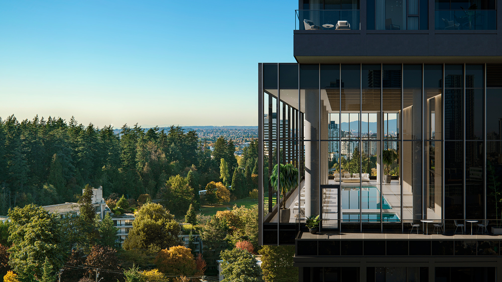
Gensler’s newly designed Central Park House, a residential high rise in Vancouver, was designed to give residents an urban experience with connection to nature and remarkable views. The site is just steps away from their central park and rises 41 stories high. This residential building’s intention is to be both grounded and elevated. Located about two-thirds up the tower is the Horizon Pavilion. Cantilevered off the building, it contains the multi-floor amenities, serving as a unique oasis for residents and their guests. Designed to be lifted up and into the sky, at the horizon, it is the most visible and identifiable exterior design element. The ventilation of the building is designed in a way to create a constant flow of fresh air — a true luxury in urban environments.
The building is grounded at the street level. A double-height lobby welcomes residents home, providing a private sense of arrival, sheltered from the noise and bustle of the city. Inside, the resident apartments range in size from 400-square-feet to 2,700-square-feet, allowing for diversity in resident affordability and family size. Each apartment has floor-to-ceiling, energy-efficient glass and balconies that extend the living space into the surrounding landscape.
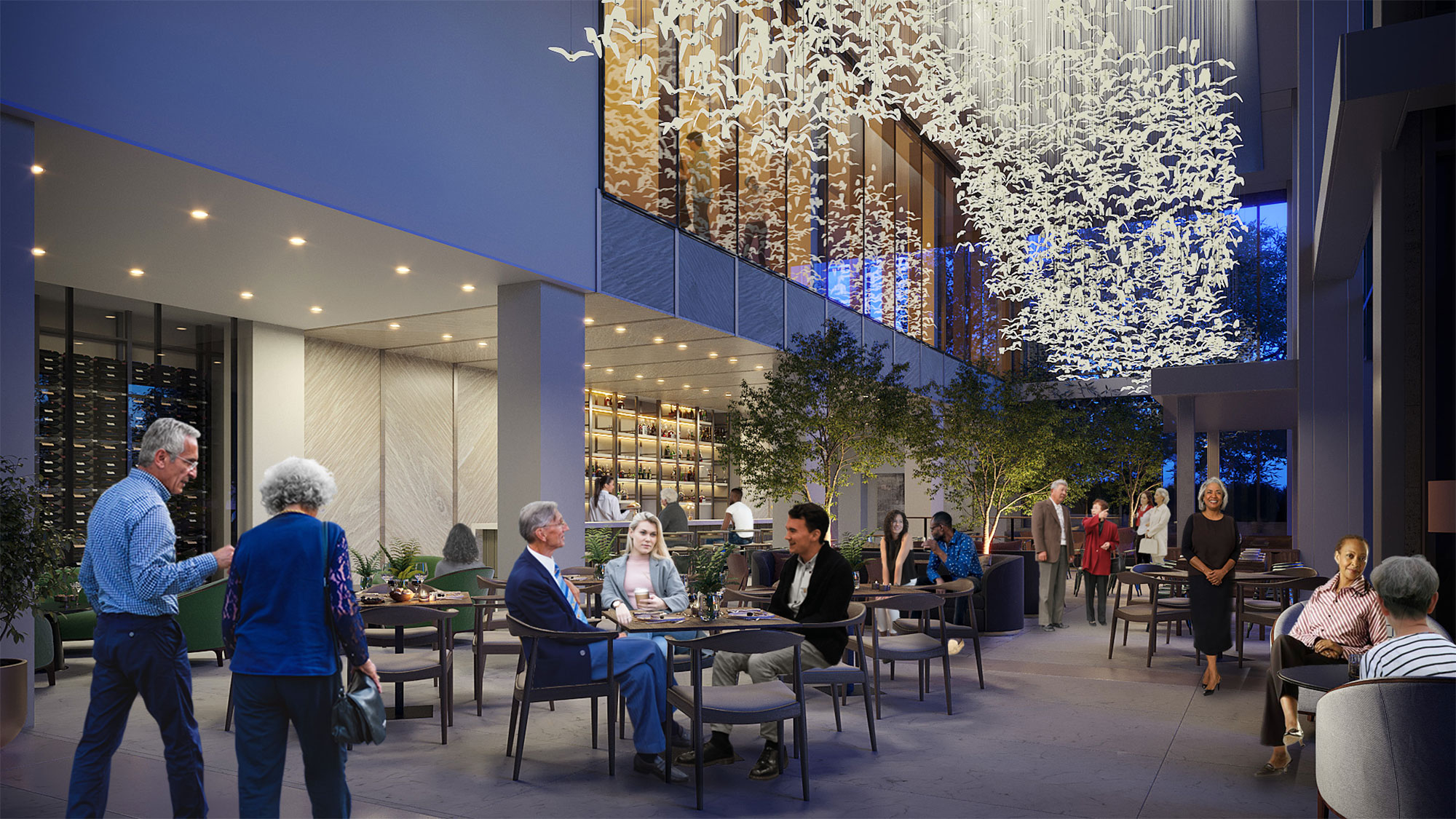
In a comparable manner is the recently designed 55+ urban independent living project in Lancaster, Pennsylvania called Mosaic via Willow Valley. At 22 stories high, it will be the tallest building in Lancaster, with a two-story podium and 20 stories of residential units above. Inspired by hotel branding, operations, and design, there is a porte cochere, a two-story arrival, a lobby restaurant, ballroom, spa, fitness center, and residents tower bar.
All the public spaces have been designed to celebrate community and gathering, seeking to invite in people of all ages, understanding the importance of intergenerational engagements. The amenities do not seek to duplicate already successful local businesses in this urban neighborhood, but rather embrace the local businesses and provide different offerings that both residents and the public can enjoy.
The naming and branding of the spaces are intentionally developed from the historic and context of Lancaster County. Such as recalling the history of Lancaster being called the Red Rose City and roses being a symbol of connection, this is the foundation for the design and branding of the ballroom. The site for this building was previously a printing press, so the tower bar will be called Inkwell, providing legacy to the Lancaster County newspapers once delivered from this site.
This project was designed with a Gensler team with expertise in residential design, hospitality design, brand design, healthcare design, and senior living design to truly invent, with Willow Valley, a new product — a new, authentic living experience. Celebrating the significant role older adults play in the success of urban communities, the project is designed using all three components (brand, operations, and physical space) to create memorable living experiences.
Design superpower #3 - Design for health
The last design superpower is to design for health. Given our knowledge in evidence-based design, we know nature can impact health and wellness, as can designing for all our senses.
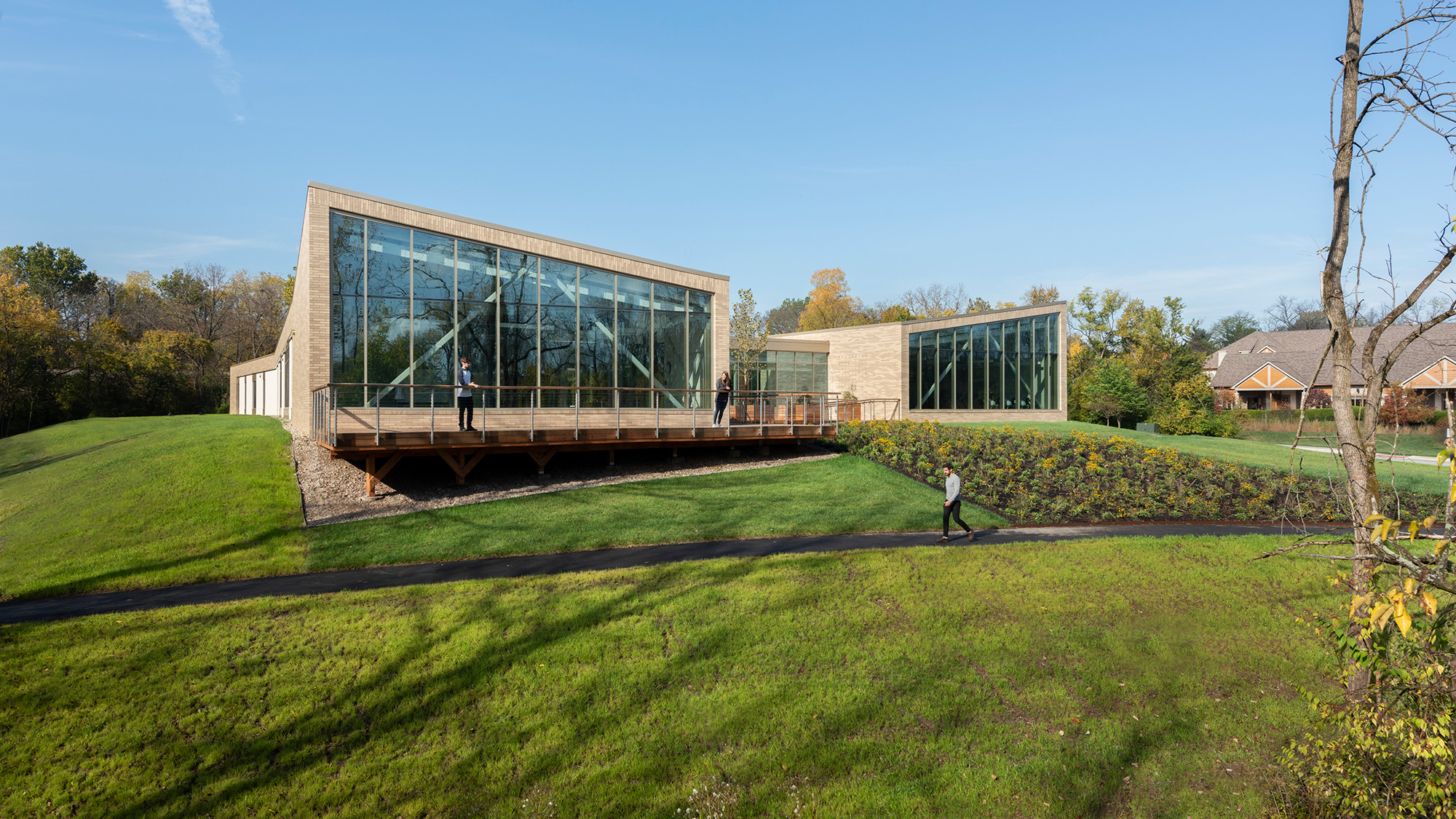
In designing the OhioHealth Neuroscience Wellness Center, our design sought to impact health in many ways. The first was for the building to literally sit “in” nature with all the fitness and training spaces being provided nature view. Views of nature can reduce blood pressure, encourage positivity, and support well-being. The building also serves as a beacon, a lantern of sorts, so you can easily find your way in those early morning or late afternoon visits. Inside the Neuroscience Wellness Center, natural light permeates all spaces. It snows in Ohio, so the corridors connecting the geriatric clinic, and the large rehab spaces also serve as a walking track — so movement can be supported in all four seasons. And by looking inward, into the central courtyard, the building also provides a place for staff to step outside and recharge between patient visits. Designing for staff health and wellness is a critical component in all facility types, especially healthcare.
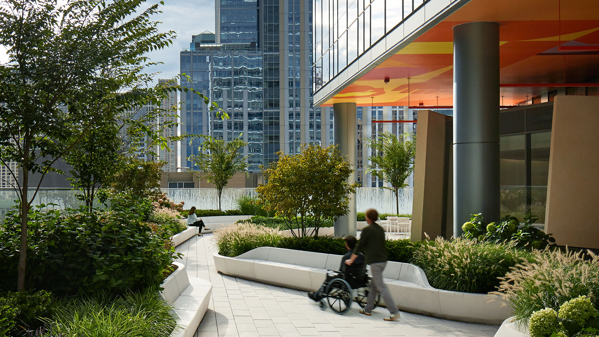
Access to nature also can be designed into urban settings. In helping design Shirley Ryan AbilityLab in Chicago, the team placed the rehabilitation hospital’s 10th-floor Sky Lobby adjacent to gardens wrapping the building — and touting expansive views of the city skyline and Lake Michigan.
Shirley Ryan AbilityLab is a global leader in physical medicine and rehabilitation for adults and children with the most severe, complex conditions — from traumatic brain and spinal cord injury to stroke, amputation, and cancer-related impairment. Upon opening in March 2017, Shirley Ryan AbilityLab became the first ever “translational” research rehabilitation hospital in which clinicians, scientists, innovators, and technologists work together in the same space, surrounding patients, discovering new approaches, and applying (or “translating”) research in real time. The building interior features bright colors and patterns to inspire and encourage movement.
We integrate health into all our work — including aviation. We have been design partners with the San Francisco International Airport (SFO) for over 40 years. The renovation of SFO’s Terminal 2 included the expansion of locally sourced organic food, the integration of more daylight, and easy access to water stations throughout. Terminal 2 brought the first ever dedicated airport yoga room in North America. Throughout all areas of the airport the lights subtly change color to align with your circadian rhythms, to support the natural physical, mental, and behavioral changes we exhibit in a 24-hour cycle, and to reduce the impacts of jet lag. Designing for health can be applied to all project types, specifically those that can have a positive impact on older adults.
Design from the inside out, design for memorable experiences, and design for health illustrate just three ways design can be used as a superpower. You too can use design as a superpower to make an impact in the senior living industry.
For media inquiries, email .
