Hudson Grace
San Francisco, California
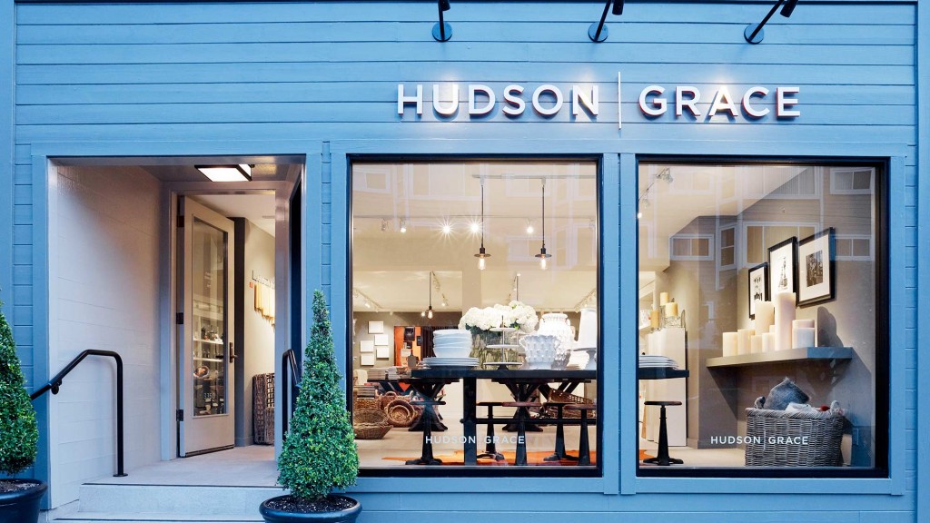
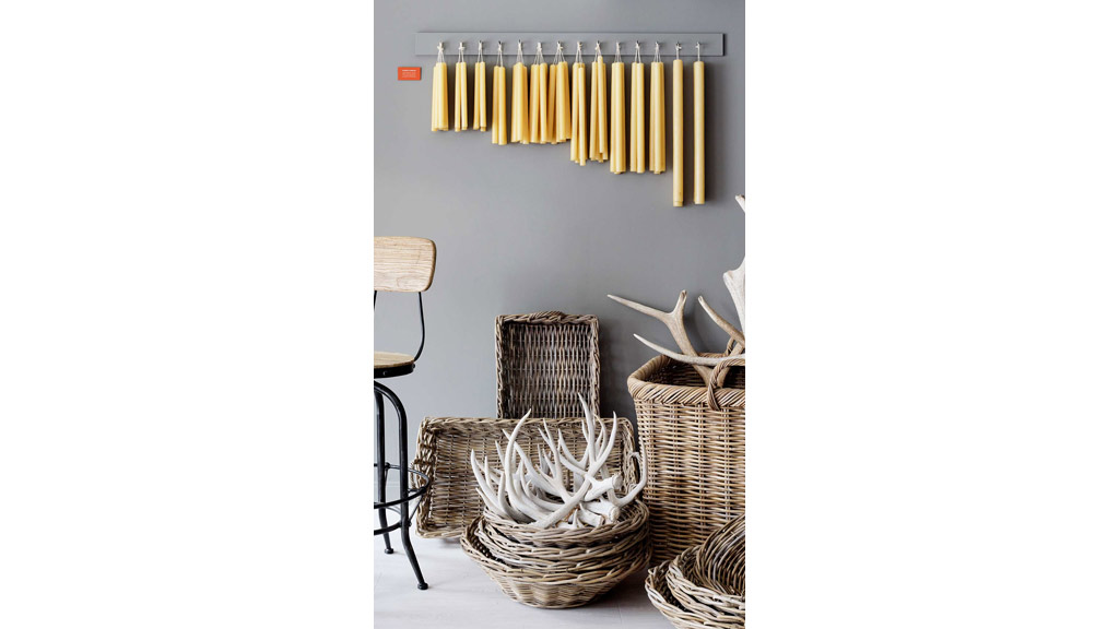
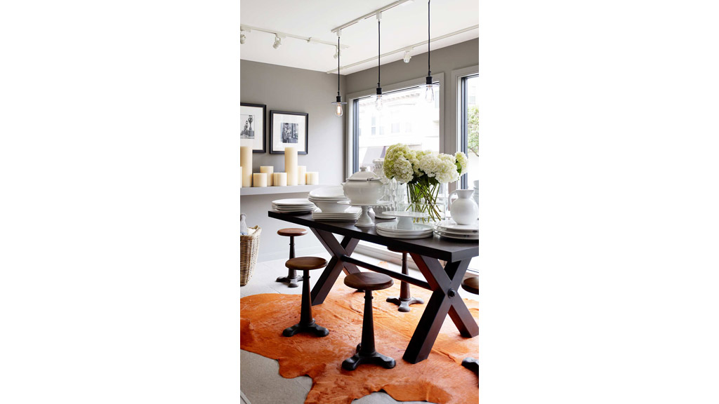
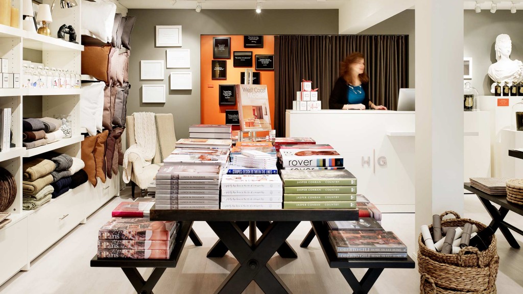
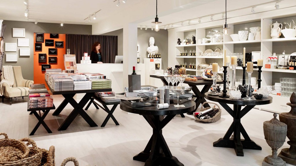
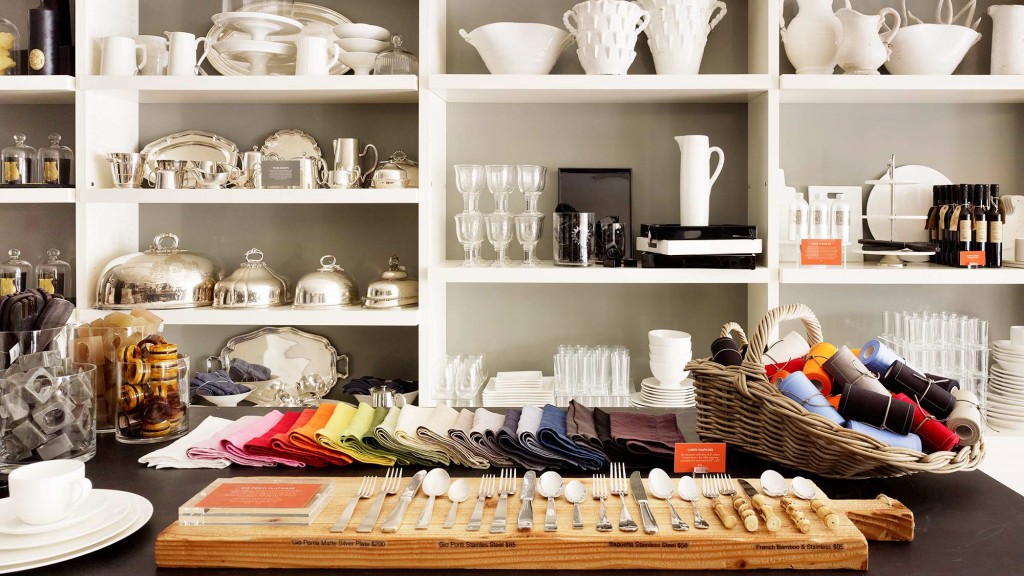
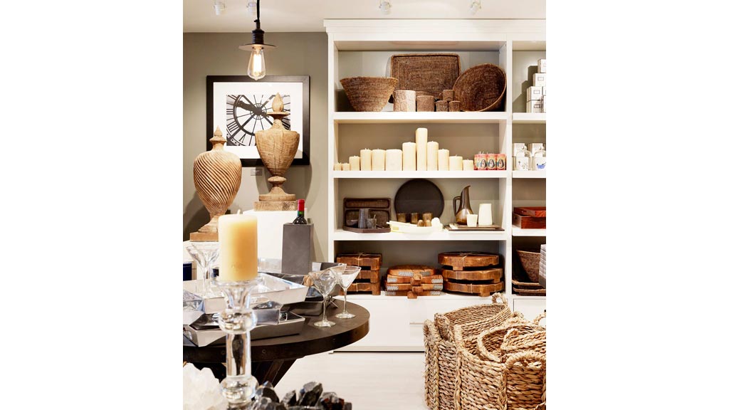
Restraint and design discipline, along with modern detail and quality craftsmanship characterize this Hudson Grace store. A well-balanced play of high-gloss and matte surfaces help to differentiate millwork features from the residential architectural envelope. Brand colors of white, gray and international orange – referencing the Golden Gate Bridge – are strategically integrated within the store and exterior signage to compliment a primarily neutral merchandise palette. Floor fixtures of cold rolled steel and dark wood juxtapose the cash wrap and display pedestals in ash and warm white paint. A low ceiling height creates an intimate and personal scale, expressing the store’s concept: “a house, a home.”
Expertise
Recognition
-
Association for Retail Environments (A.R.E.)
2013 A.R.E. Design Awards – Outstanding Merit – Hardline Specialty Store (up to 3,000 square foot)
