Cyxtera
Addison, Texas
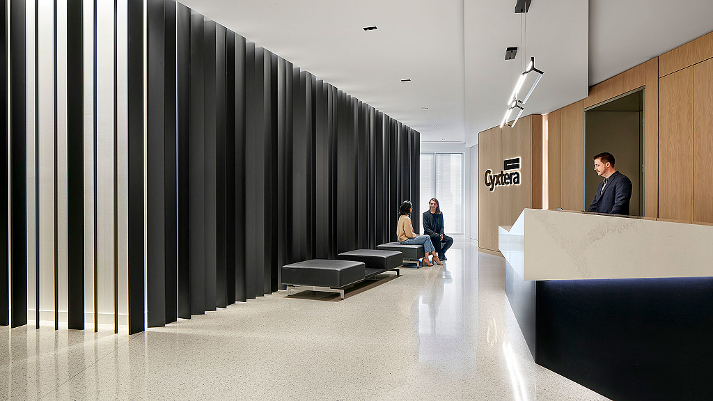
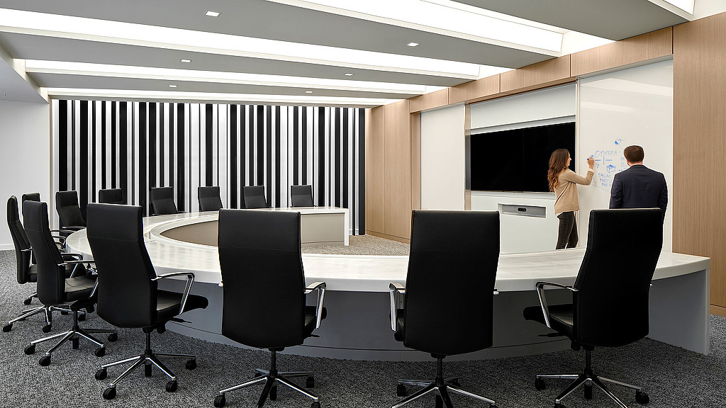
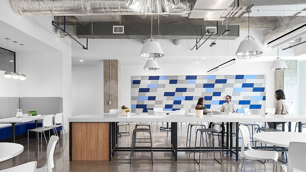
Having outgrown their original space, Cyxtera, which provides IT security and infrastructure solutions, needed additional space to accommodate their needs. They used their growth as an opportunity to create a new space that was their own and distinctly tech — clean, sleek, and minimal — but also budget responsive.
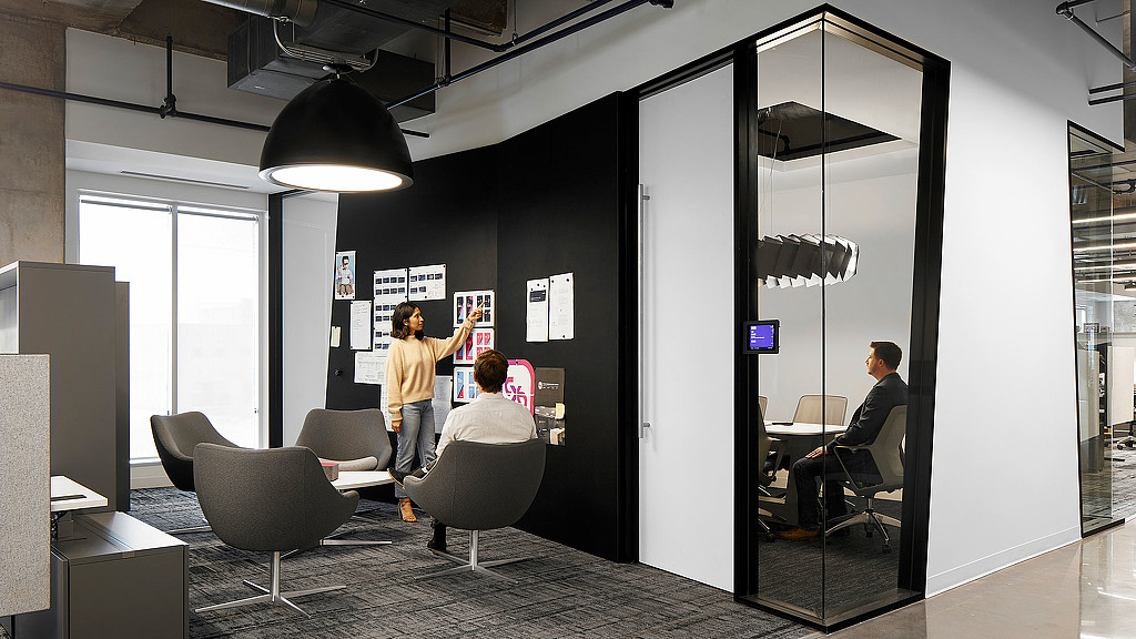
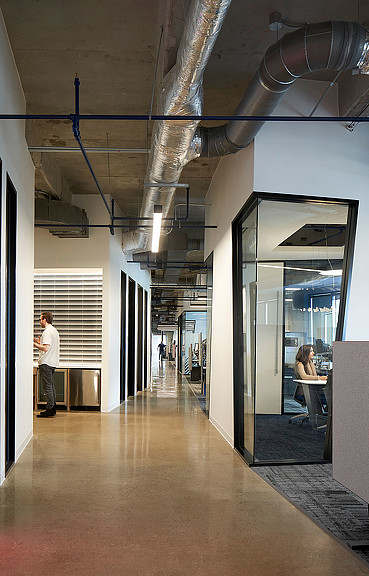
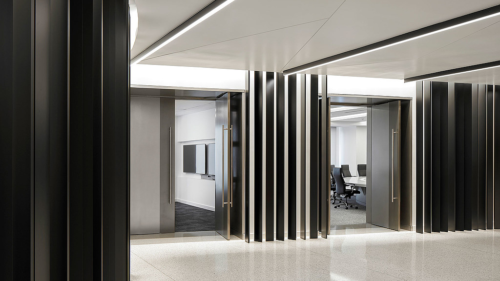
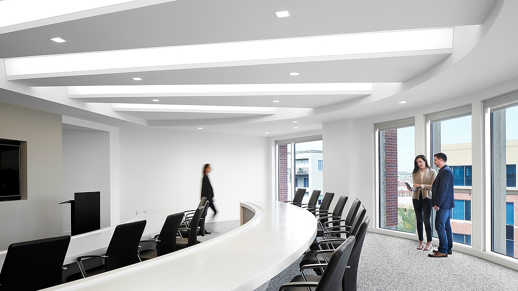
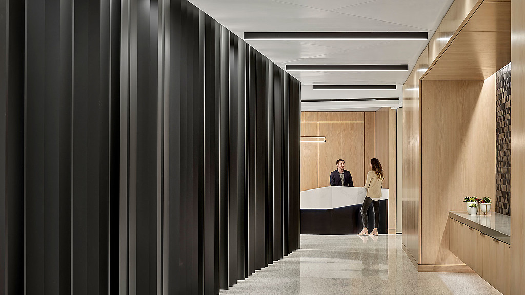
The plan is organized with several shifts in geometry creating a unique planning approach that results in a space which is dynamic and less monotonous. This allows for brand integration directly into the architecture, using vertical light boxes covered with a magenta gradient film to highlight brand colors. Exposed ceilings allow for bold pops of color with sprinkler pipes painted royal blue. The injection of accent colors compliments the overall neutral palette of whites, blacks, and grays.
