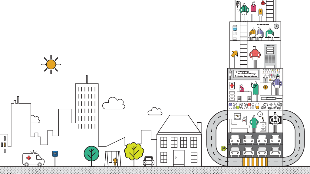
Can better wayfinding improve the patient, visitor, and staff experience in healthcare settings?
An Easier Hospital
What We Did
The Context
The Results
Basic interventions—signage, naming conventions, pathways, and entrances—should be the first priority for improving wayfinding. Building identification signage, directional signage, pathway definition, entrance definition, and landmark definition are currently not given enough priority in hospital design. As a result, they are often ineffective and confusing. Once the basics are working, there are opportunities to improve the experience by providing a more integrated and comprehensive wayfinding system. Human factors like staff training and knowledge, as well as digital factors like apps and digital directories, can work with the built environment and signage to aid different populations in wayfinding—and enhance their overall experience.
An integrated approach to wayfinding that includes human, physical, and digital interfaces provides the most opportunity to enhance experience and improve satisfaction levels. The most effective wayfinding systems are multidimensional and address many aspects of the user journey from beginning to end. They are also human-centered, empowering a diversity of user types to find their own way and build mental maps that make the journey easier.
What This Means
Make destination points easily identifiable. The use of medical terminology in signage can overwhelm patients. For example, a parent taking their child for treatment of an inner-ear infection may not understand what the Otolaryngology Department is, but will understand “Ear, Nose, and Throat.”
Identify important locations with distinctive design cues. This could be a unique entryway, piece of furniture, or storefront. It should be clearly visible and easily described—for instance, by having a recognizable color, shape, or object.
Clearly mark pathways and reinforce navigational cues. Visual cues include creative naming signage, directional signage, graphics, landmarks, and view corridors. They must occur frequently along a path to provide reassurance to people as they navigate, making reorientation easy and seamless.
Multiple forms of communication (visual, verbal, and digital, for example) should be integrated into an optimal wayfinding strategy. Interactive kiosks or visitor help desks can supplement pathways and signage by providing directional printouts, or they can be sent to a patient’s or visitor’s smartphone.
What’s Next?
Learn More
Team
Barbara Bouza, Elizabeth Brink, Gretchen Bustillos, Stephen Kellogg, Pia Sachleben, Amy Siegel
Year Completed
2016
Comments or ideas for further questions we should investigate?
