How Do You Define Museum?
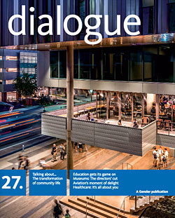
The idea of the art museum is in constant flux. As a building type, it walks a fine line between aesthetics and purpose, a fusion of art and programmatic intent that speaks to artists, curators, patrons, and communities. As a firm that helps bring these complex projects to life, Gensler invited four prominent directors to discuss their museums as exemplars of design and intent.
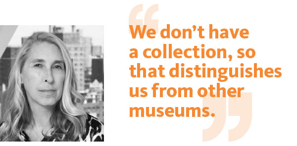
Lisa Phillips: We have a very special mission: to look at new art and new ideas and new possibilities for museums as institutions. That’s been part of our history since 1977. It puts us in a great spot to innovate and experiment and question the possibilities for institutions. We don’t have a collection, so that distinguishes us from other museums. We’re a museum of very contemporary art. And it’s hard to stay contemporary if you’re devoting resources and space to a collection that’s aging and becoming historical. So this gives us a lot of freedom, to experiment and to be nimble and to act on things very quickly as they’re happening.
I look at the museum as an incubator for new art. We’re commissioning things all the time. We have a triennial that features emerging artists from around the world, early-career artists. We have an active residency program. We’re incubating ideas through our scholarships and publications. We’re doing a series of critical anthologies with MIT Press, which will publish the first one, Mass Effect—a history of art and the Internet—in September. We stage conferences. Idea City, a conference and festival on the future of cities, is an example. We see conferences as a platform equivalent to our exhibition program. That’s not typical for a museum either.
How does the museum relate to new media?
LP: New media is something that we were very involved with early on through the Media Lounge, with Rhizome, which is an affiliate organization we brought on 12 years ago. It’s also how we’ve approached our website, which is a space for presenting art and to visit. We’re commissioning artists every month to do digital work on our website. It had 2.5 million visitors last year, compared to the 350,000 people who actually visited the museum. It’s huge. And we have a really strong social media presence on Facebook, Twitter, and Tumblr.
Tell us about the museum as a building.
LP: We wanted it to be open and inviting to the public. That was part of our program when we were getting ready to design it. SANAA, the design architect, envisioned the lobby floor as an extension of the sidewalk. The idea is that you don’t have a barrier. I think more museums are sensitive to this now. The old-style museum building was like a castle or a fortress, protecting the valuables, but we’re not like that. We want people to experience art right away—to experience it on the façade even before they get inside.
We also wanted a building that wouldn’t be too precious, because we know that artists are always testing the limits of a museum. And SANAA was really understanding about that. We’ve drilled through floors, lowered ceilings. The exhibit spaces are designed so the art looks really good. I see the museum as kind of an expanded version of an artist’s studio or a loftlike space. There’s light on every level. There are skylights on every floor.
How does the museum relate to its context?
LP: We’ve always been downtown. After going through 9/11 up close, we recommitted to that and also wanted to be trailblazing in our choice of a location. The Bowery—always a place we were told not to look at or walk in—seemed like an ideal place to build. It was languishing and full of possibility. The Bowery came to represent Skid Row, kind of a sore spot in the city’s landscape, but it’s got a much richer history.
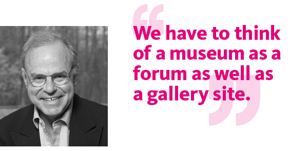
Michael Conforti: Museums have to think of themselves beyond their galleries as they broaden audiences to include younger communities, linking those communities to the museum in ever more imaginative ways. We have to think of a museum as a forum as well as a gallery site.
How does the Clark relate to education?
MC: The Clark has a dual mission, and is both an art museum and a center for research and discussion of ideas in the visual arts. It’s also a center for curatorial training and art historical education. As part of our dual mission we organize a graduate program with Williams College in the history of art. Williams College is one of the great centers for higher education in the visual arts. Many of its undergraduate and graduate students go on to become curators and directors. In addition, and curiously, there are more art historians per capita in Williamstown than any other place in the world.
How is this reflected in the buildings?
MC: There is a quality of the Clark that separates it from most other art institutions: we started as a private collection—a bit like the Huntington in Pasadena, the Barnes, the Gardner, or the Frick. Our core permanent collection has expanded, as have our public, research, and education programs. Annabelle Selldorf, who led the renovation and expansion of the existing museum and the Manton Research Center, did an incredible job of enhancing the experience of the particular “period in time” aesthetic that was first put in place when the museum opened in 1955. We also wanted flexible spaces, especially for special exhibitions, as well as other public and support spaces. We now have a large-scale temporary exhibition space, which lets us experiment with themes that go well with our permanent collection and our core research programs. We are no longer confined by the character of our original building and collections, and yet we continue to honor them.
Tell us about the museum program.
MC: The Manton Research Center houses one of the largest art history libraries in the country, as well as the Clark’s collection of prints, drawings, and photographs. The new Clark Center, designed by Tadao Ando, is a visitor center and a temporary exhibition site that encourages the museum to think well beyond our existing collection frame. The Clark Center can also be used for conferences and special events. Selldorf made the original art museum, designed by Daniel Parry in 1955, come alive again with an elegant and modern consciousness. Another Ando building at the Clark is the Lunder Center at Stone Hill, home of the Williamstown Art Conservation Center. Its galleries are often used in the summertime for contemporary projects. For all these reasons, it’s hard to talk about our program in simple terms. The buildings embrace the wide variety of programs we do, and they sit in an extraordinarily beautiful, hilly landscape that is, in and of itself, a special public treasure.
How does the Clark relate to its context?
MC: We have 140 acres and we program on the campus regularly and often. Our campus expansion project was as much about enhancing the landscape as it was about adding and renovating buildings. We maintain a special quality of being a research center as well as an art museum, but one that exists in a unique natural environment. The Clark is located on the side of a hilltop, and many of our visitors come just to walk our campus. They want to spend time in the new facility, the terraces, and around the water feature that connects our buildings, but they also want to walk our extensive trails and experience the incredible view one gets from the top of Stone Hill. The view from our upland campus takes in the Green Mountains of Vermont and the Taconic Range of New York. To be situated in this vista landscape is unique among art museums. It’s very special indeed!
Michael Govan: Art has been around for millennia, while museums were created a few hundred years ago to provide access to and preserve objects of art or material culture. They now are also involved in the production of art, because there are so few mechanisms left to commission and produce art on a large scale.
The term “accessibility” includes all the facets of access—physical, emotional, and intellectual. It encompasses not only the physical space of the museum, but publications, lectures, related programs and artistic events, and online presence.
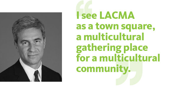
I see LACMA as a town square, a multicultural center and gathering place for a multicultural community.
The art world requires flexibility and nimbleness, but a building is a commitment to time and space. How do you navigate that, in planning LACMA’s growth?
MG: A lot of people will say “Oh, it’s just the art. The building doesn’t matter.” Well, rectilinear box galleries are a particularly coded cultural construction—they’re not neutral! Every decision is important when you’re framing cultural objects that have deep philosophies and ideologies embedded in them.
How do you prepare physically and architecturally for the great variety of art, whether heavy or complex?
MG:You want a building where you can put a big steel sculpture on the ground—because if you can’t accommodate Richard Serra, you shouldn’t be in the business of being a contemporary art museum. But you don’t want something that has too much weight and absoluteness if the idea is to accommodate many different kinds of art in different emotional registers.
If museums only comprised beautiful static, permanent concrete walls—walls that didn’t move but had a heaviness and depth of light and shadow and feeling—they could be overwhelming. Conversely, if everything were built to be temporary and functionally rearrangeable, that would also be flawed.
One of the nice things about Renzo Piano’s buildings at LACMA is that they’re very matter-of-fact, yet quite dynamic when you consider the whole experience: riding the elevator, seeing the sky, the palm trees, and the Hollywood sign, looking out onto the changing view as you’re going up and down the glass elevator, and walking into an art space with skylights and windows.
How do you see your responsibility to education?
MG:Total. What I dislike is this idea that you have an art museum and then you add education like frosting on a cake or an additional ingredient. Everything we do is fundamentally educational.
Education is something to do with learning, with expanding one’s range of experience, feeling, and knowledge all together to incorporate new things, new ideas, new feelings, new experiences.
How do you use new media?
MG: We collect art made in new media. We also have updatable scholarly publications, and we emphasize the two-way street of social media. We have many digital initiatives, including tweeting in Spanish and English, award-winning blogs, and context-aware beacons that send information to your mobile phone as you walk through the galleries. But what I’m most proud of is that we’re the fourth most Instagrammed museum in the world, according to Instagram’s own data. That’s meaningful considering that more visitors are inspired to share their experience of LACMA than is the case at other museums worldwide with much greater overall attendance. And that social media is driving our physical visitor statistics up all the time.
Do you consider the museum itself to be art?
MG:People sometimes posit as adversarial the relationship between art and architecture. Or they suggest that the museum itself is an artwork. I think the key for a museum is to create conditions that ensure that its management and all the people who work there provide for a meaningful back and forth between the art and the architecture.
The goal of museum design is always to think about that relationship. When you put art in a museum, the museum becomes its context. And context matters.
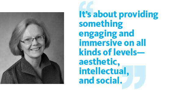
Kathleen Howe: We begin by asking what happens intellectually, in an engaging way, when someone comes to our museum. We want to encourage them to visit, and convey that it will be fascinating. It’s about providing something engaging and immersive. We want that to happen on all kinds of levels—aesthetic, intellectual, and social. It’s great if there’s something just jaw-droppingly wonderful once in a while, yet there’s also room for moments of quiet discovery.
How do you translate this into built space?
KH: I think we suffer from hubris in thinking that we can, with an architect and with a museum staff’s input, come up with the perfect building that weds the art and the architecture. I feel sorry for architects because they’re hearing from museum people that they want this beautiful—always beautiful—and logical, easy-to-traverse building. And then we turn around and we say, “Oh, but we’d really like the mystery and the chance of discovery to be there.” Well, okay. Then we talk about it being transparent. But, oh no, we don’t want windows. And then we insist on having elegant galleries. But then we’ve got a student demographic, so we find ourselves saying we need some kind of domestically scaled space to house the more social activities that weren’t part of what the museum did previously. And no matter what kind of built space you have, it will eventually be challenged by an artist who wants something very different, who wants to reconfigure it or interrogate it.
As we’ve been working on our new building with Machado and Silvetti and with Gensler, the assumption seems to be, “Here are the parameters. Make it work.” We seldom say that to an artist. You don’t hear a curator or director telling, say, James Turrell or Chris Burden, “Well, I’m sorry. This is the space, we won’t significantly alter it, and that’s what you have to work with.” Yet we expect the architects to work within all of our parameters.
Tell us about the museum’s program.
KH: Our starting point was that we’re a collecting institution. And if the collection isn’t accessible and available to classes and students, then however you set it up, it’s like a library that has books that you can’t get to. It’s useless. Part of being accessible is having an entrance that is apparent and welcoming. Our program specifically described the characteristics of the entry experience. Visitors need to know how to get into the building. They should get some sense of what goes on there. They should be able to tell that it’s open and, more importantly, that they are invited in. And because we’re in Southern California, we asked for a really large exterior space—a social, aesthetic, and intellectual space for our students and other visitors.
A key piece of this was Michael Asher’s intervention in 1969, when he took the doors off the Pomona College Museum and built this weirdly shaped, blind-pouch gallery. It was an extraordinary piece. For our “It Happened at Pomona” show, he declined to re-create it. He countered, “I propose that the museum remain open for the entire length of this segment of the exhibition”—nine weeks, seven days a week, 24 hours a day. And we did it. That openness and the ways the museum functioned at different times really sparked our thinking about access.
How will the museum relate to its context?
KH: The museum serves the entire consortium of the Claremont Colleges as an academic resource across the curriculum. We are firmly committed to the education of our students at both Pomona College and the Claremont Colleges. And we really think that if students leave here without having a museum experience, we’ve failed.
The communities we live in are the bigger layers around the campus. We live in Claremont, a small town that’s college-centric. Beyond it is the Inland Empire, which is economically depressed. We have a lot of visitors from there—from Ontario, Fontana, and places like that. There’s a big population pool to the east that extends to San Bernardino and Riverside. It’s essential that admission is free, and that when people walk in, they feel welcome. The other community we address is the greater Los Angeles arts scene. It’s important to us that our peers there think we do really good work and present beautifully installed shows. The Los Angeles Times’ Christopher Knight listed one of our shows in his year-end roundup of the 10 best.
Art museums today have to be more accessible, and willing to experiment. We have to engage these different communities in ways that resonate with each and all of them. I like to think of our museum as a free-trade zone—a place where different people can meet and interact with each other, and with the work and ideas presented by the artists and curators.
Eva Hagberg, who conducted the interviews, has published three books on architecture and design, and is a regular contributor toMetropolis and other design and cultural magazines.

