Tips for Signage and Wayfinding in a Post-COVID-19 World
May 06, 2020 | By Amy Bixler, Molly Murphy, Jill Wittnebel, Javier Cortes
Editor’s Note: This post is part of our ongoing exploration of how design is responding to the COVID-19 pandemic.
Across the world, various countries, states, and cities are beginning to ease restrictions put in place to prevent the spread of the coronavirus. Stores, schools, and workplaces are beginning to slowly reopen — or may soon plan to. But no matter how this transition occurs, one thing is clear: it won’t be business as usual. How do we redefine our spaces for this new reality?
As employees and customers step carefully back into the world, we will need to shift our behaviors, interactions, and ways of moving through space. New signage and wayfinding graphics, when implemented thoughtfully, can encourage practices to help people navigate this new world.
In support of our clients as they plan to bring people back to their offices, stores, restaurants, and other gathering places, we’ve outlined some ideas for signage and wayfinding graphics that introduce new practices and can help people feel at ease in this time of uncertainty.
Following are four best practices for signage communication and wayfinding graphics in a post-COVID-19 world:
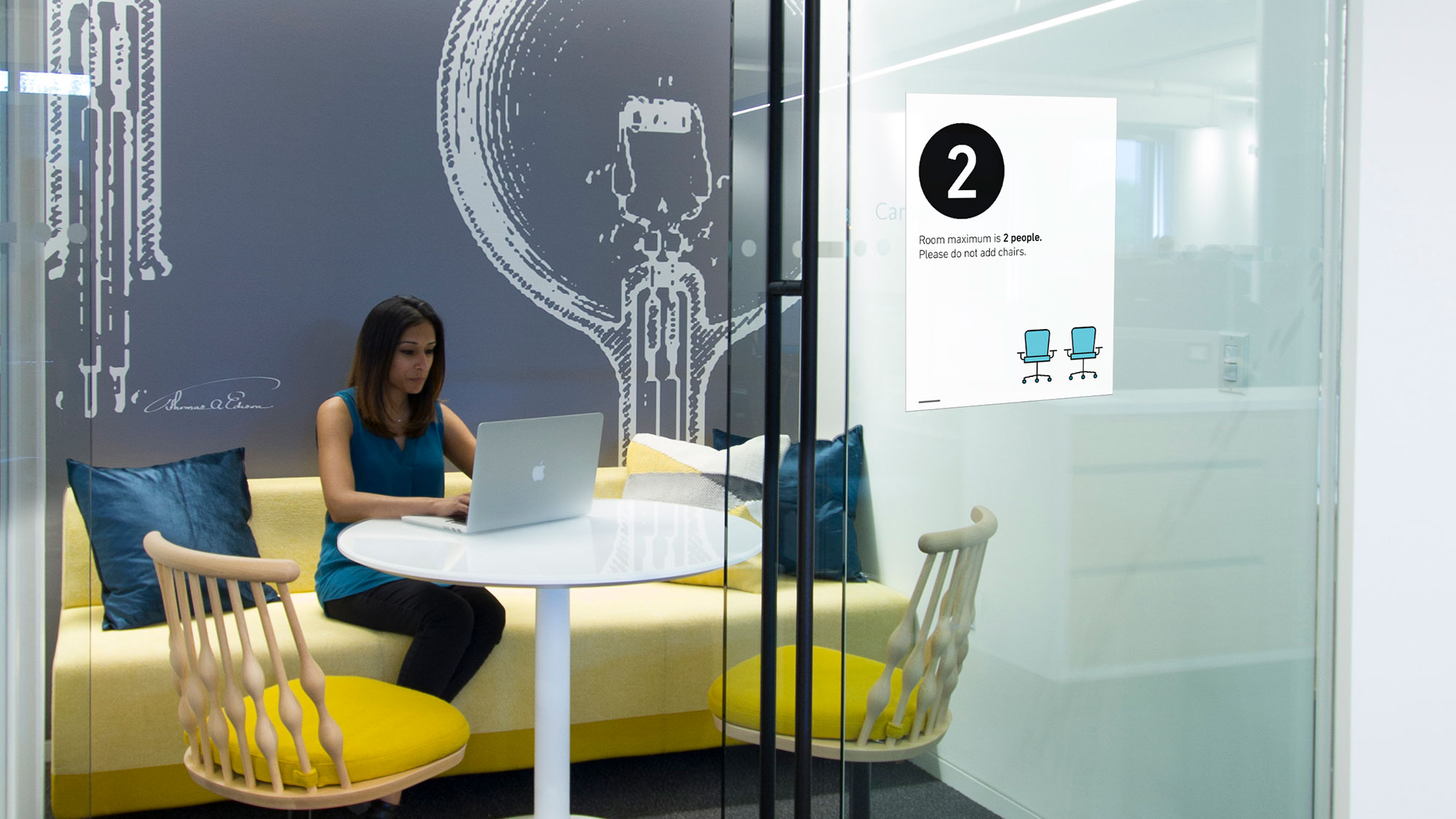
1. Use your signs to communicate in a way that is friendly.Existing off-the-shelf signs can sometimes induce stress. While the messages are important, the color palettes and typography of some signage can make a space feel harsh, dangerous, and unwelcoming. Shifting the design and tone of voice to something more friendly and human can help to instill a sense of community and common purpose.
Instead of alarming messaging such as “Put on a mask!” try signage that is less harsh, and illustrates how new behaviors might benefit the collective, such as “Let’s wear masks.”
2. Think about how signage can assist in the entire user journey through a space.When selecting your signage system, it’s important to fully consider what is most important to the people who are returning to these spaces — what are they thinking, feeling, and needing? Examine the full user journey — from the moment they leave the safety of their homes to getting situated at their desk, or shopping again in their favorite stores, or sliding into a booth for dinner with friends.
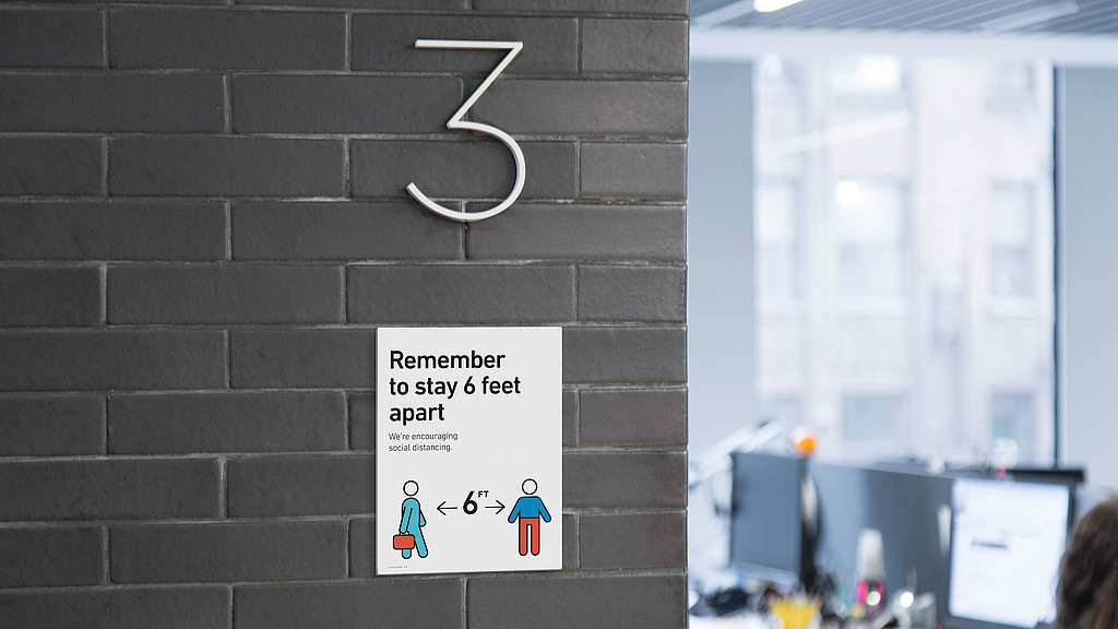
For example, consider introducing friendly messages like “Welcome back” at the entrance, physical distancing floor decals in elevators and lobbies, and “Let’s wash our hands to protect each other” signs in restrooms.

When used correctly, instructional signage, positive messages, and iconography can enhance the user experience. Helpful signage such as welcome signs; markers for security and check-in processes; hand sanitizer stations; meeting room cleaning protocols; and more can be even more impactful when supported by a companion communications campaign that lets customers, employees, students, and guests know that new measures have been implemented.
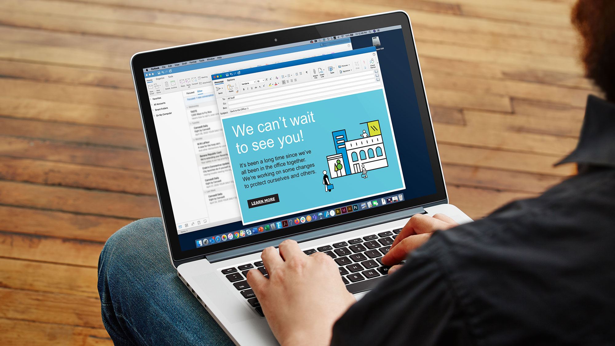
Develop friendly, uplifting messages for email, social media, and other digital communications, along with printed collateral in the physical space, to let people know what to expect when they return.

As we help our clients tackle these new challenges, we have an opportunity to design an experience that articulates the organization’s brand and integrates with the architecture of each space. By transforming what otherwise could feel ominous and restrictive, innovative solutions can create a positive and uplifting experience.
Use clever phrasing, creative illustrations, or other visuals that are uplifting and align with the personality of your brand. Also consider the material, color, location, and scale of these new signs so that they complement the space.
Our spaces, the tools we deploy to help people navigate, and they way we engage with one another have already significantly transformed as a result of this pandemic. Through the power of design, we can address these needs proactively. By focusing on the user experience, we can ultimately transform this challenge into an opportunity, creating more enjoyable and connected places for everyone.
We believe every organization should have the tools needed to plan for the return to the office during these uncertain times, and we want to help. Please contact us to begin a conversation about how these tools can support you now and into the future.
For media inquiries, email .


