Product Design Gets Redefined
When Creating a Wall for All
September 01, 2022 | By Scott Star
Much of product design is intuitive, with creatives sketching on napkins as soon as they receive their clients’ briefs. Gensler’s New York Product Development practice tends to take an analytical approach, getting a lot of heads around the subject up front through a visioning process that can involve round table discussions, depth interviews, surveys, and charrettes — all to make sure we’re heading in the right direction before putting pen to paper or firing up SOLIDWORKS®. In the end, the visioning exercise validates our client’s brief, fine-tunes the brief, or subverts the brief entirely. And in the case of a recent project with a leading manufacturer in the partition wall industry, it was subversion that led to the right, and most revolutionary, outcome.
The client in question came to us to design its next demountable partition system — the type of framing and glass paneling product used to construct private offices and conference rooms in commercial workplace settings. But after a series of round tables and interviews with Gensler interior designers practicing across multiple industry sectors, our project team advised the manufacturer to switch gears. We told our client that there were already plenty of viable options available in this product segment, and what our interior designers and their clients really wanted was a partition system that would allow employees to easily restructure and repurpose the many open areas of an office, as shown in orange on the plan below.
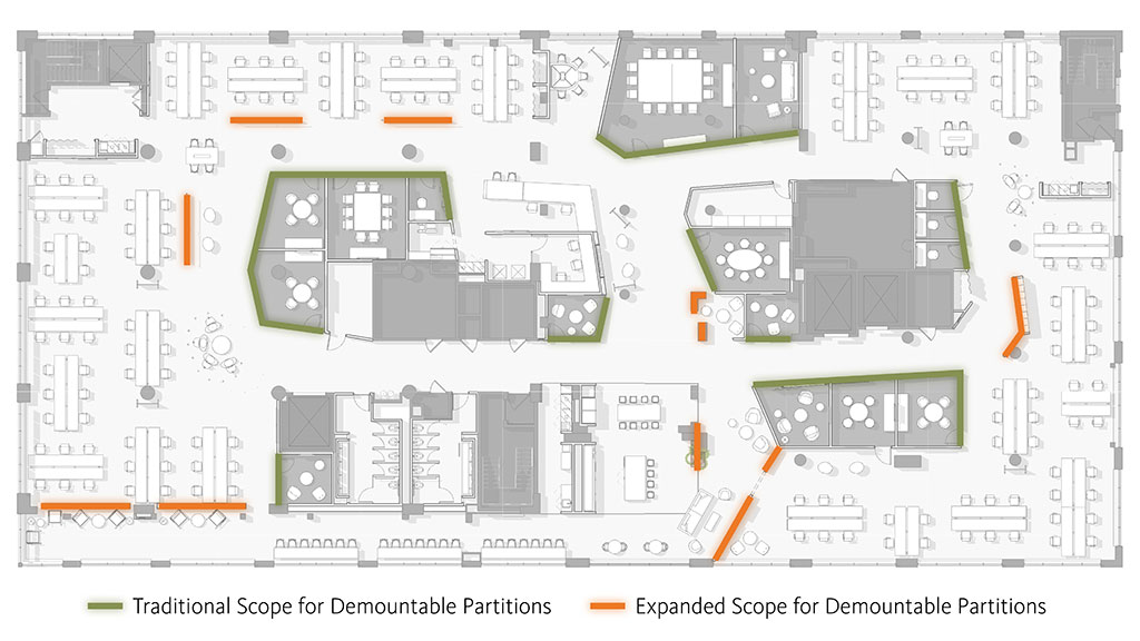
According to Carlos Martinez, Gensler principal and project design director, “As organizations work more dynamically, there’s a greater need for products that give users the ability to transform and customize shared spaces with autonomy — and to make these changes often and instantly, without the need for a work order or a tool kit. So, we wanted to design a product that could define open areas with the right type of functionality — and the right balance of porosity and privacy — for the task and tenant at hand. And one that would always be attractive, no matter how it was configured.”
Our client lead, the CEO of the company, was wonderfully receptive to our suggestion, and you could see the wheels turning in his head as he instantly abandoned his original plan. What we were proposing — and what he foresaw — was a complementary product that would distinguish his company in the market and allow him to expand his business without cannibalizing its existing demountable partition sales.
With the idea of end user autonomy front and center, we initially contemplated a Lego® inspired stackable block system that would allow workers to build the partition wall of their dreams at will. I’ve managed the product development process across dozens of industries for many years now, and it’s amazing how frequently Lego is referenced as a design objective. The world owes more to these tiny toys than it will ever know, but we ultimately concluded that this type of construction, while fun and familiar, would inhibit the quick reconfigurability we were after. Playtime was over, and our system took a much different form.
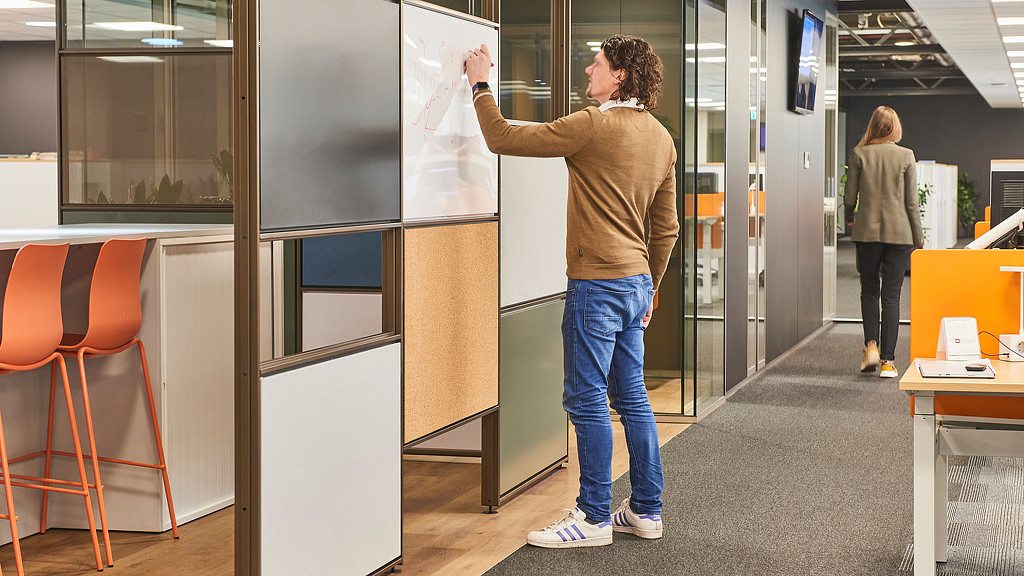
After evaluating five alternate assembly concepts across a range of dimensions, we settled on a design with three key components: vertical profiles, to be positioned between the floor and ceiling; horizontal profiles, to span the vertical profiles at multiple, easy-to-position heights; and snap-in-place panels, available with a variety of functional and decorative surface finishes. Together, these modular parts achieved the desired flexibility with user and interior interfaces that are mechanically elegant and quick to affect.
5 Banners for Better Product Design
While the plans for our new partition system were crystallizing, so was our outlook for the future of product design. It’s a given that a carefully conceived product will deliver on its intended function. And our manufacturing partners rightfully presume that the products we design for them will look good. But once these imperatives are met, how can our development efforts go further to meet the ever-increasing ambitions of owners and tenants, improve end user experience, and foster well-being at large?
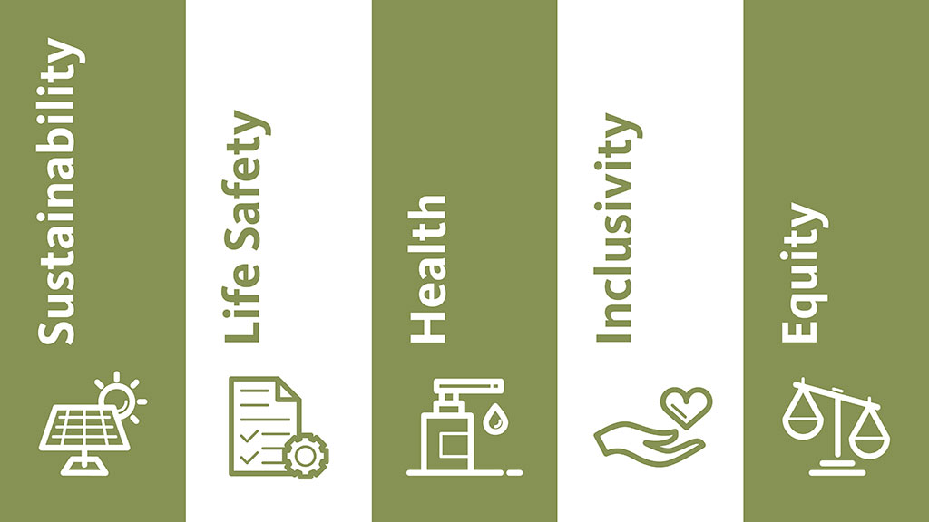
Five principles beyond function and aesthetics have come to guide our product design strategy. Each of these banners is relevant, in some way, to most every product designed for use in the built environment. Each is aligned with Gensler’s overarching thinking. And each is on display in the partition system we affectionately refer to as the wall for all.
1. Sustainability
“One of the most important considerations in designing a product is its impact on the environment throughout its entire lifecycle,” contends David Briefel, sustainability director and Design Resilience leader in Gensler’s New York office. “And to the extent that a product can be reused repeatedly and recycled eventually — extending its life and the use of its materials — all the better. The goal is to keep the product in the economy and out of the landfill.”
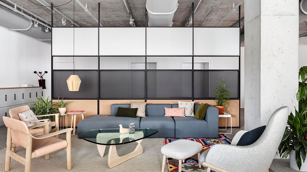
With vertical profiles that can be relocated in a facility, moved to another address, and cut down or extended to accommodate new ceiling heights, there’s never a need to jettison our design. It adapts to the shifting needs of owners and tenants in equal measure, ensuring its ongoing utility.
Cradle to Cradle Certified®, the system’s circularity is further enhanced by its materiality. Steel makes up the bulk of its components, with a significant portion coming from pre- and post-consumer recycled sources. And all non-steel hardware and finishes can be detached, allowing the steel components to be further recycled at the end of the product’s long life.
2. Life Safety
Among the most useful and enjoyable aspects of our design is the ability to add, subtract, and change-out panels in an instant, letting end users personalize a shared workspace with just the right surfaces to support their immediate activities. Steel, perforated steel, textile, marker board, cork, and more are all available. This means that a space that serves as a touchdown spot for visitors in the morning can transition into a brainstorming hub in the afternoon and be opened up for a social event when the workday wraps.
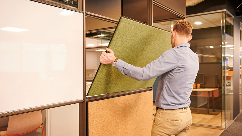
What makes this possible is a simple magnetic connection that allows the panels to attach to both sides of the steel profiles in a snap. What makes it safer are the secondary reinforcement clips, applied without tools, that back up the magnets and fortify the system against impact due to accident and misuse.
The connection of the vertical profiles was also devised to improve life safety. Inner adaptors are offered with specialized attachments for different ceiling and floor conditions, as well as venues with increased seismic activity. The system, once installed according to the manufacturer’s instructions, complies with the transverse load requirements of the International Building Code.
3. Health
Biophilic design — where the design of an interior draws on elements of the outside world for inspiration — expresses itself in many forms with many degrees of success, but in the case of adding natural vegetation to the workplace, the effects are overwhelmingly compelling. Plants have been shown to increase the physical health, emotional ease, and productivity of employees, so it’s no wonder that they’re used regularly to help meet the requirements of many of the most progressive building standards, including the Living Building Challenge from the International Living Future Institute.
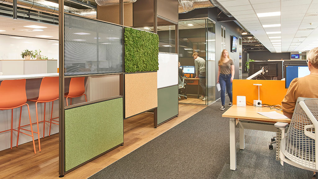
With snap-in-place panels of flat moss and reindeer moss, our design provides owners and tenants with a simple way to bring the power of plants to employees and visitors alike. Moss panels can be added to select cells in the system grid or used to create expansive, non-stop green walls. The possibility to abut the moss panels with other panel types is an especially appealing feature for interior designers going for a mixed material look, plus the moss is sound absorbing, keeping the space a bit quieter, too. Easy to maintain, it requires no watering or trimming. Just hang it up and revel in its relaxing woodland vibe.
4. Inclusivity
Inclusive design strives to deliver products and environments that are useable and enjoyable by the greatest number of people, regardless of their physical abilities or limitations. It’s based on seven principles of universal design, with one being especially relevant here: “Size and Space for Approach and Use,” which is intended to ensure accessibility regardless of the user’s body size, posture, or mobility.
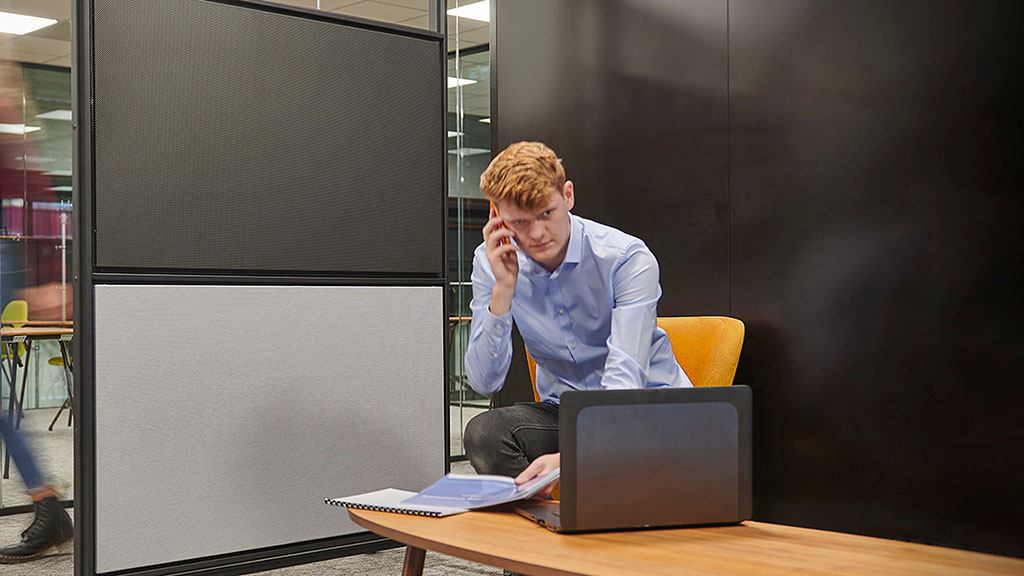
With the ability to position panels at heights ranging from 1.5” to 10’ at roughly 15” vertical increments, reach to writable and tackable surfaces can be made comfortable for virtually any seated or standing individual. Moreover, horizontal profiles and panels can be configured to allow for 27” of vertical clearance from the floor, providing adequate space for the forward approach of a wheelchair and ensuring the product’s ADA compliance.
5. Equity
Hybrid work has raised questions of employee equity that are expected to become increasingly more widespread and complex, and products are certain to be part of the collective answer. Keeping a remote workforce better anchored to the mother ship, and on even footing with on-site staff, is a challenge that has already spurred a litany of software solutions, and the integration of digital technology into the analog product realm is starting to gain headway, too.
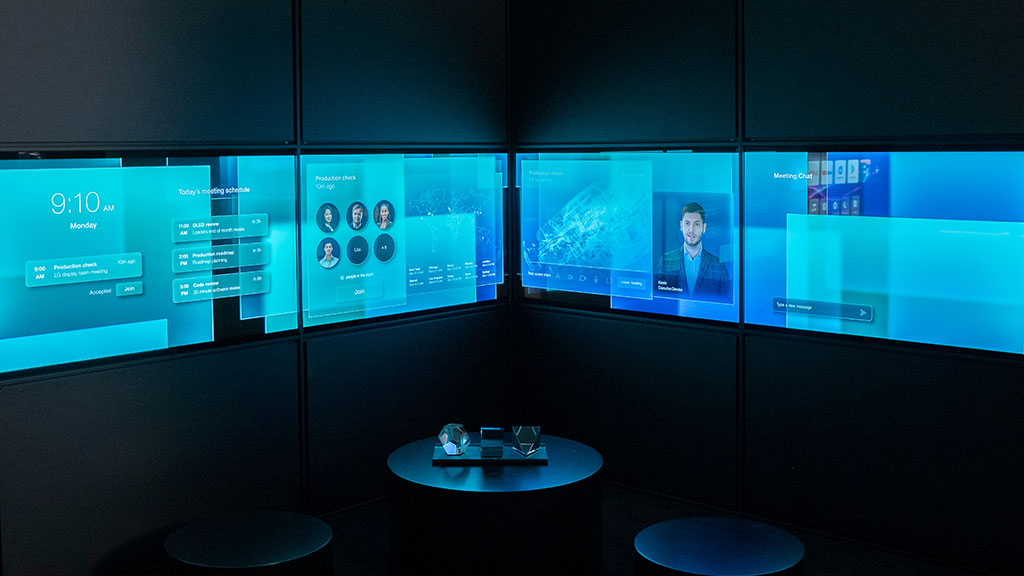
Working with a leading maker of digital displays, our design is being readied to accept transparent OLED screens. Offering vivid color and ultra-slim electronics, these digital panels can be mixed with all of our original panel options to fashion work walls that are not only multifunctional and dynamic, but also favorable to a virtual audience.
“The transparent nature of the T-OLEDs supports unique physical and digital experiences and brings new dimensions to visual presentation,” comments Michael Schneider, former Gensler director of media architecture. “The displays are especially good at showcasing content in a holographic-like manner, so 3D models and remote participants in hybrid meetings start to appear like they’re actually in the room. And by simply changing the content on the screen, you bring a whole new level of flexibility to a system that has flexibility at its core.”
The Upside Everyone’s After
With thoughtful planning and execution, a product can be designed to check many boxes beyond the ones most obvious, and if it’s conceived with a character that allows it to adapt to changing need, better yet. Products like these are the ones that deliver more utility to more users, the ones that people hold on to, and the ones that have the potential to result in the greatest experiential, environmental, and economic upside.
Click here for more information on Modular Partition Systems
To learn more about Gensler’s Product Development practice, please contact Scott Star at .
For media inquiries, email .
