Inclusive Product Design:
Everyone Has a Seat at the Table
April 15, 2022 | By Scott Star
Attending a face-to-face business meeting these days is a much awaited pleasure, but it’s not without its challenges. Hybrid work models are raising issues of equity. Technology continues to evolve, so there’s new hardware to master and software upgrades to absorb. Connectivity, oftentimes spotty, can shut things down in the blink of an eye. Plus, you’ve always got to be on your game.
So, as an employee or guest, how would you feel if you had the added complication of merely getting into the conference room and pulling up to the table? Yet that’s what many wheelchair users, and users of other mobility devices, have to contend with when the room layout and furnishings are less than ideal. Some of the more common problems:
- Circulation paths are too narrow.
- Turn ranges are non-existent or too compact.
- Table legs and bases get in the way of wheelchair footrests, casters, and rigging.
- Tabletops collide with wheelchair armrests.
- Table-integrated power ports are beyond the reach range of seated users.
Obstacles like these, which lead to frustration and embarrassment, make people feel unwelcome. But with careful planning and thoughtful design, the conference room experience will be seamless for all users, no individual will feel singled out, and everyone will get the most out of the space. Everyone will have a seat at the table.
Conference Room Planning 101
The current ADA guidelines for conference room layouts and conference room tables are your place to start, but the accessibility standards mandated by local building codes — which align with ADA but differ in some respects — must also be considered. By and large, these requirements are dimensional in nature and intended to provide adequate room for the use of a wheelchair, other assistive devices, or personal assistance.
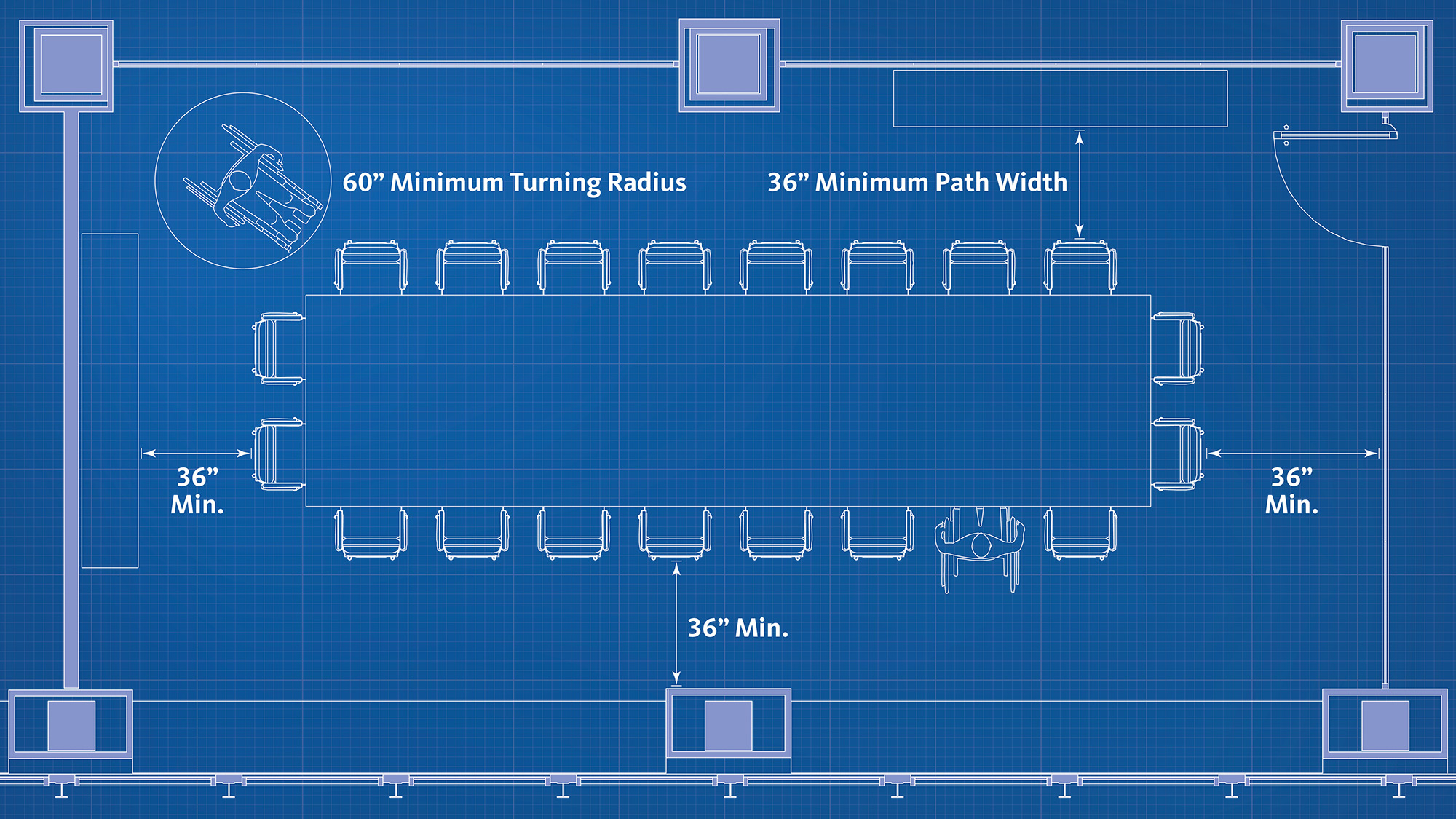
For conference room layouts, the guidelines are calibrated for sufficient maneuvering clearance at both sides of the door, a 36” wide path to a wheelchair accessible seat at the table, and a turning radius inside the room of at least 60”. In the best of cases, the 36” wide path will lead to all seats at the table and all seats will be wheelchair accessible.
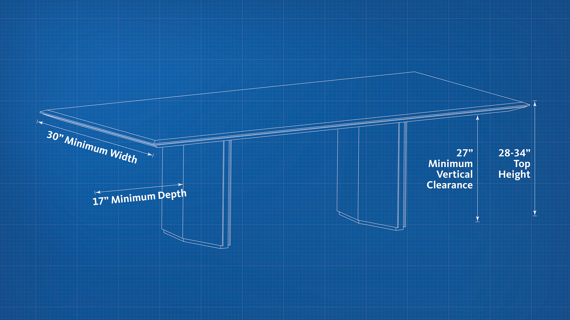
Tables must have a top surface that’s 28-34” high, vertical clearance from the underside of the top of at least 27”, unobstructed depth under the top of at least 17”, and a minimum unobstructed width of at least 30”. These dimensions, while not comprehensive, provide the key guidelines for helping to ensure that wheelchair users can dock comfortably with sufficient space for knees and toes.
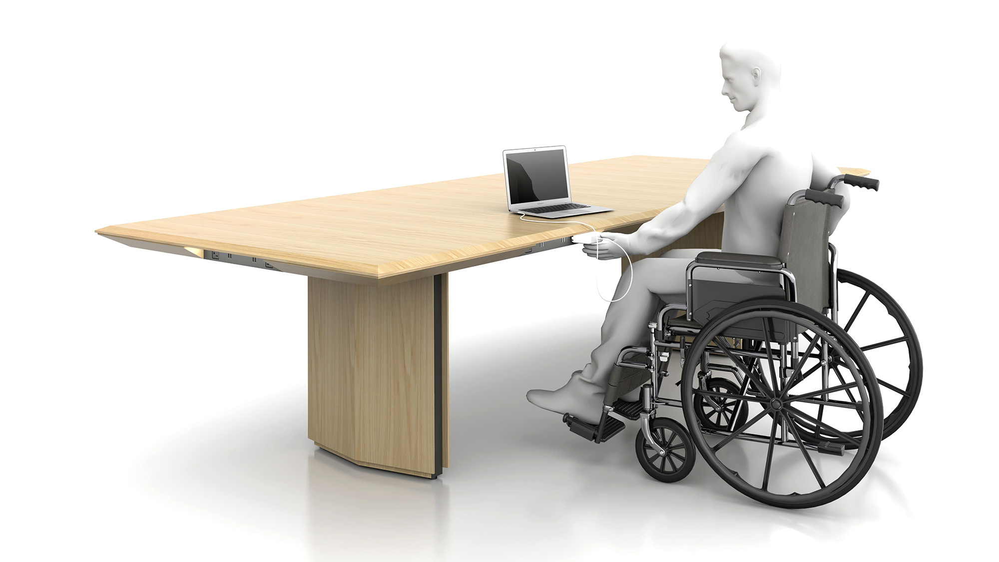
But why stop here? As product designers, we’re always challenging ourselves to go “beyond code” to deliver an enhanced experience for the greatest number of users, and the conference table — communal by nature — is a perfect place to start.
Inclusive Product Design That Goes Above and Beyond
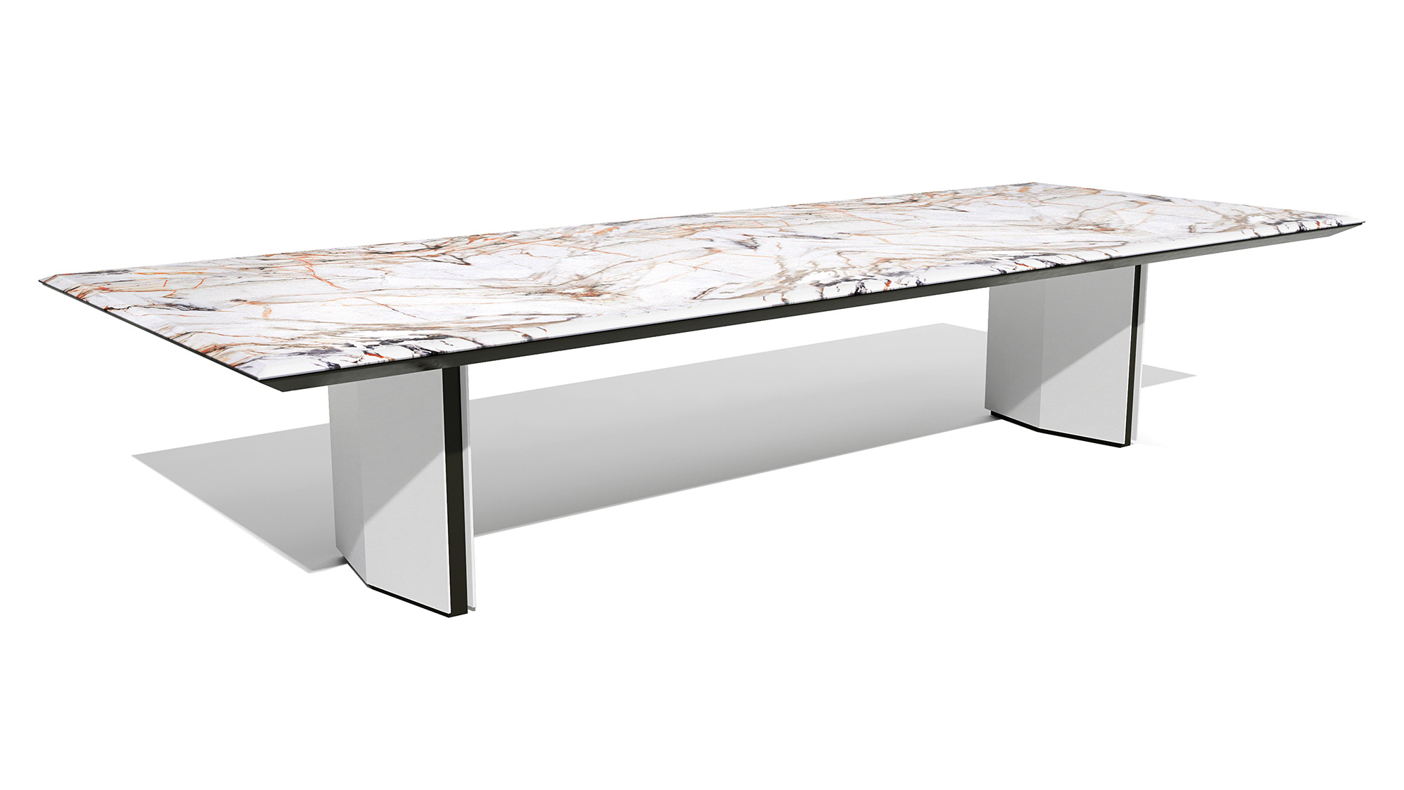
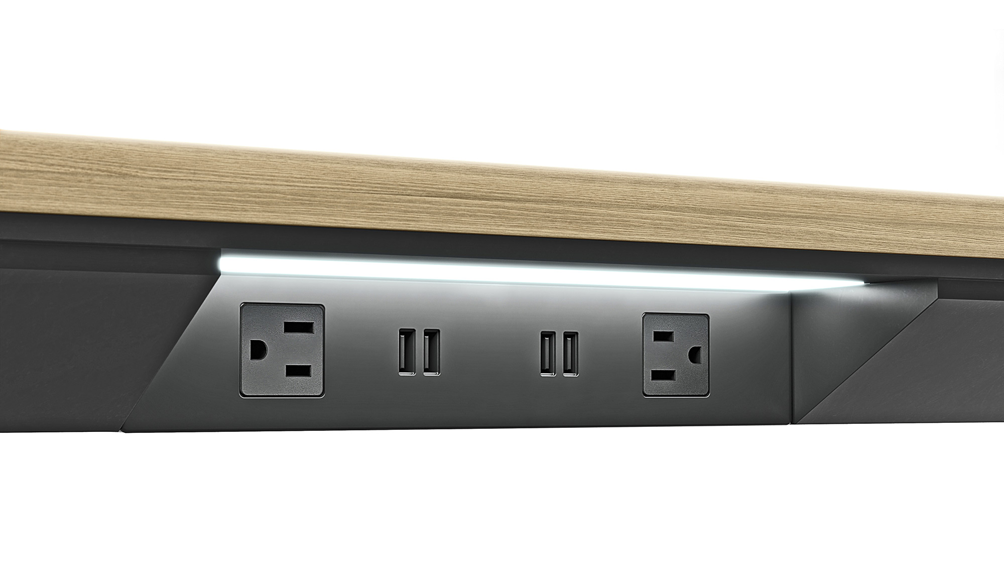
In designing one of its latest furniture collections, Gensler’s Product Development practice not only observed the relevant dimensional standards for all rectangular and boat-shaped conference tables, but it also addressed other issues of accessibility to further inclusion. Perimeter power — where simplex receptacles and USB ports are positioned at the edge of the tabletop — is a convenience for all, but it's especially appreciated by users of wheelchairs and other mobility devices, who, due to reach limitations, may struggle to connect with the type of outlets that are embedded in the center of the top. Low profile perimeter power, completely contained in the top’s edge, was created to simplify hookups while maximizing clearance. With 27” of vertical space at all points under the top — including places where bulkier perimeter power options can jut downward — wheelchair and conference chair armrests encounter less interference.
LED illumination was added to make things even better. The LEDs provide quicker calibration of plugs and ports for those with low vision conditions, while offering benefits to users at large: the light makes power access more intuitive for first-time users and keeps ports easy to locate when the space is dimmed for presentations. Designed to increase peoples’ precision and accuracy, this feature facilitates a seemingly simple act that’s actually a challenge for many.
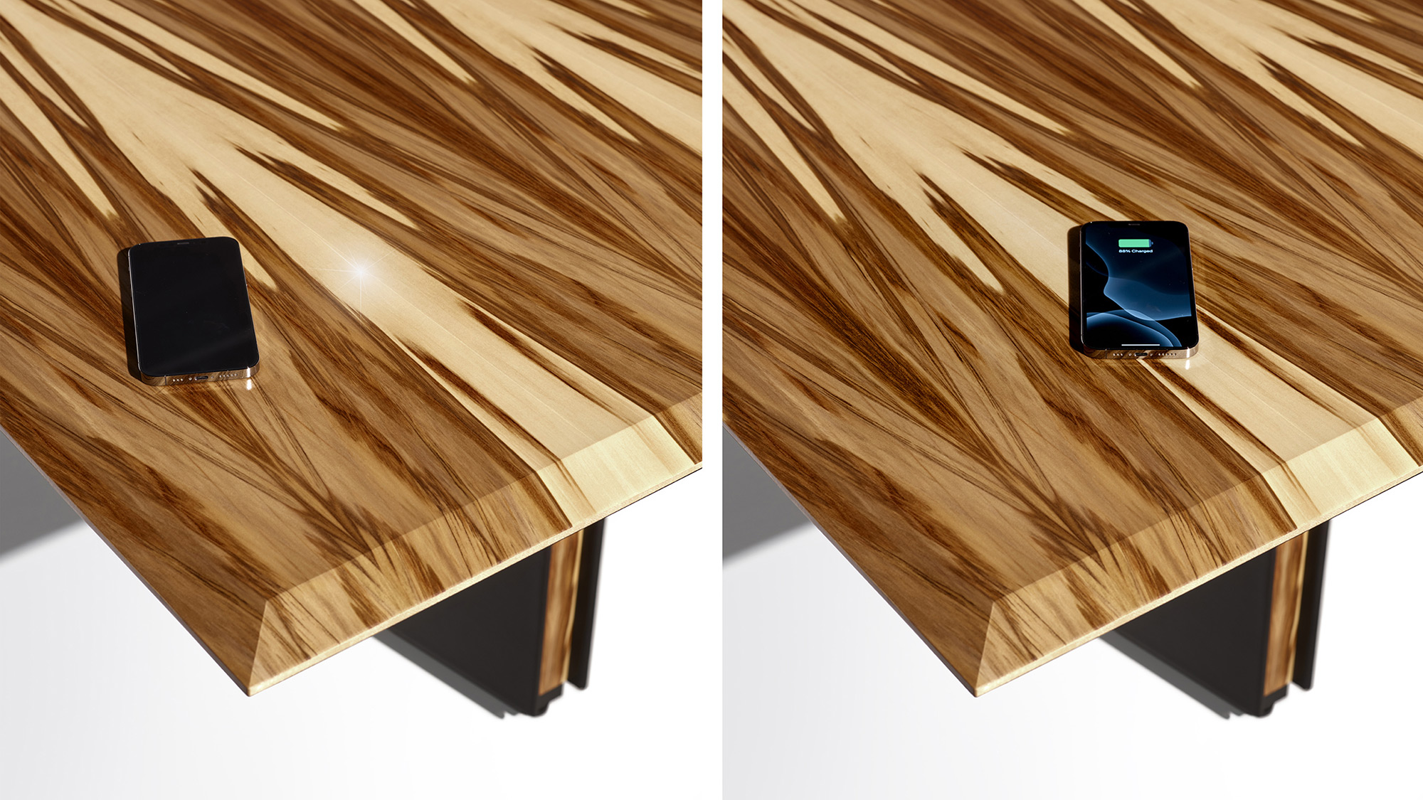
Wireless charging — offered as an option on tables with veneer tops — is another feature that's handy for all but particularly helpful to those with limited dexterity. With the need to “plug in” completely eliminated, all meeting attendees have to do is place their mobile phones over the white LED indicator lights, which designate the repowering points. Installed just below the veneer and 10” from the edge of the top, the wireless charging points are quick to spot, easy to reach, and exceptionally simple to use.
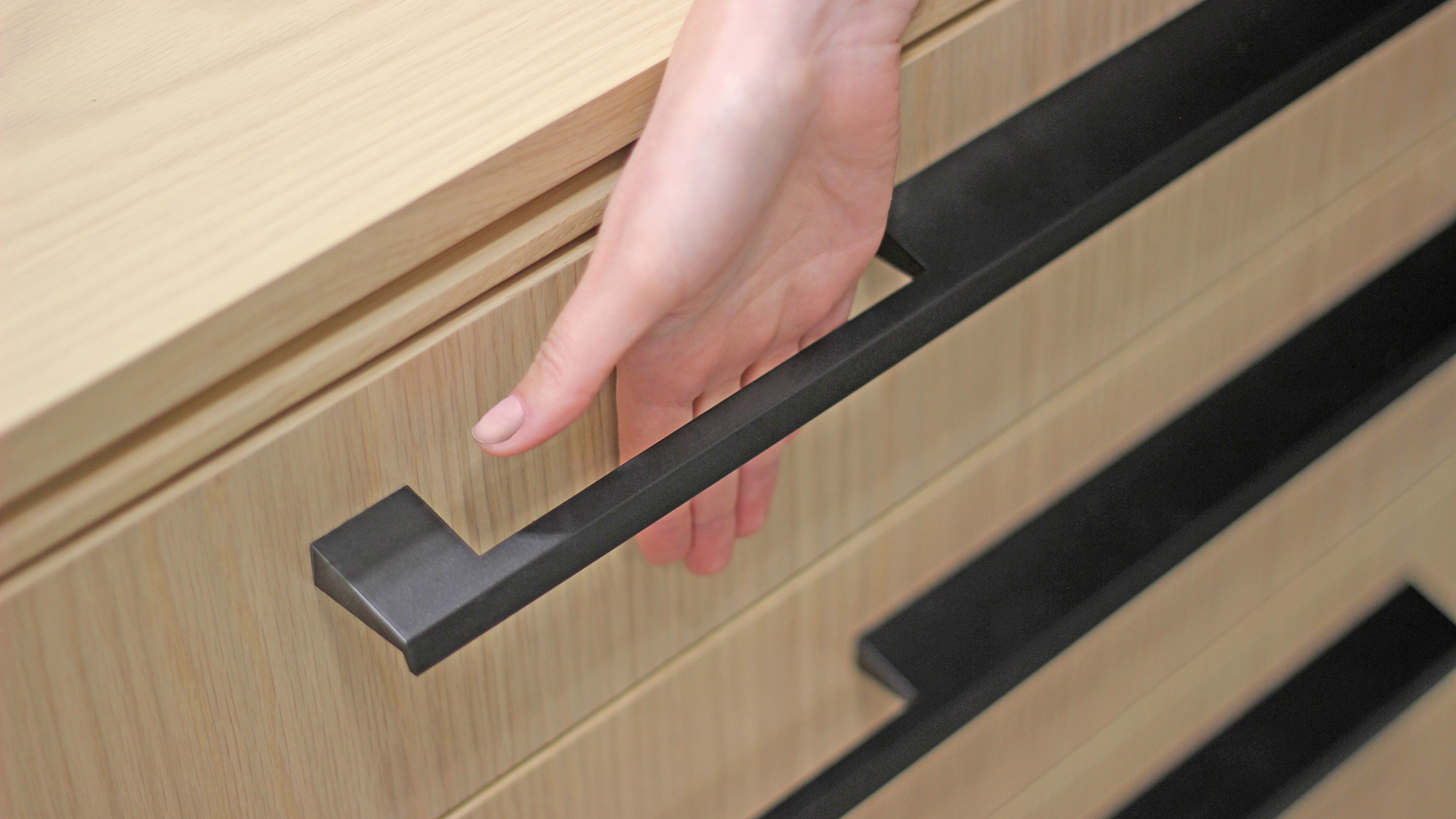
After fine-tuning the conference tables, we turned our eye to storage and the opening mechanics, in specific. Coordinating credenzas were conceived with drawer and door pulls that comply with the intent expressed in the current ADA accessibility guidelines. Designed to be operated with one hand — without tight grasping, pinching, or twisting of the wrist — and no more than 5 lbs. of activation force, the pulls make things easier for people who have a hard time “getting in” due to disability, injury, or age. Spaciously dimensioned, they accommodate a wide range of hand sizes, different angles of approach, and righties and lefties, alike.
An Elegant and Inclusive Outcome
With careful conference room planning and attentive product design, meeting-goers can be comfortable and productive regardless of their physical abilities or physical limitations. And with the right finesse, no one will notice that anything special has been done. Everyone will feel like they’re being treated equally, and that’s the best — and most inclusive — outcome of all.
Click here for more information on Inclusive Conference Furniture
To learn more about inclusive product design, please contact Scott Star at .
For media inquiries, email .

