Using Design to Improve the Transit Experience for Los Angeles Metro
November 02, 2022 | By J.T. Theeuwes
Since 1990, the Los Angeles Country Metropolitan Transportation Authority (LA Metro) has built and operated the rail and subway system for the greater Los Angeles area. Currently, the system consists of 99 stations serving seven lines and over 100 miles of track. It is considered the third largest transit system in the nation.
Over the last decade, an unprecedented expansion of the system has been taking place. LA Metro’s Long Range Transportation Plan (LRTP) will invest $80 billion to upgrade and expand the transit system over a 30-year period to include, along with the commuter Metrolink system, 22 transit corridors with 200 total stations. A few of these exciting projects are already soon to begin operation, including the Downtown Regional Connector and the long-awaited connection to the Los Angeles International Airport.
With the Integrated Station Design Solutions (ISDS) project, Gensler teamed with LA Metro to create a series of new and innovative design solutions to apply to all of Metro’s stations with the goal of improving the overall transit experience for riders by making stations easier to recognize, navigate, and use. Goals also included streamlining operations and maintenance, enhancing safety, and creating a systemwide cohesive identity using a consistent design aesthetic for the entire Los Angeles Metro system.
The team reviewed many of the best practices of world-class transportation systems and followed up with a series of focus group discussions to determine new, creative ideas for a number of station issues — ranging from better station acoustics and lighting, to bird abatement, and the design of communications and operational equipment. Additionally, the team introduced a system-wide series of station materials and furnishings to create an easily identifiable and integrated design environment.

Cohesiveness of Materiality
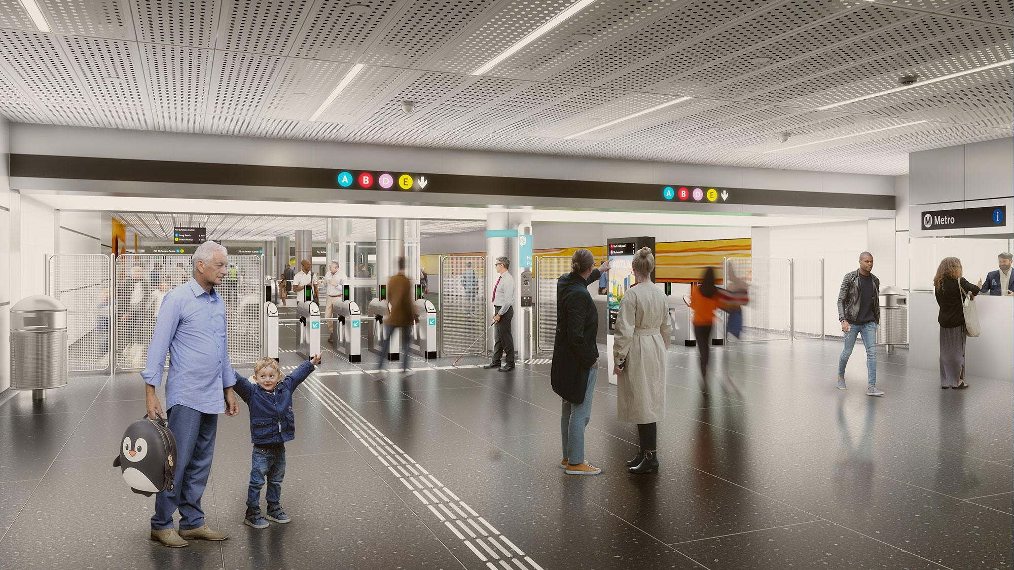
Over time, the types of materials and designs used throughout the existing Metro system have become a jumbled patchwork of materiality. Uniqueness is concentrated within individual stations while the system lacks an overall identity. Multiple types of materials for the same uses contributed to various cleaning regimens and procurement needs. Through a process of research and review, a series of optimal materials was selected for the ceilings, walls, and ground plane of the stations that would be durable and easy to clean, conceal infrastructure and declutter spaces, while contributing to an overall cohesive aesthetic.
A standardized, minimal pallet of materials would not only ease procurement, reduce replacement inventory, and streamline maintenance, but it would also reduce the visual overload of colors and textures — helping wayfinding for visually impaired, neurodivergent, and other users. This minimal, integrated expression acts as a welcome respite and a calming influence on the mind, reducing the need to cognitively multitask due to a cluttered environment and giving the mind a chance to rest from the hectic and sometimes chaotic experience of the city. Through this clarity and consistency, one can find comfort.
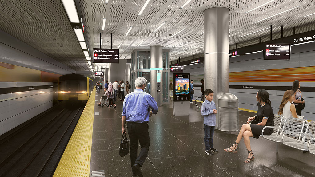
The floors are poured-in-place epoxy terrazzo that is charcoal-colored and combined with pieces of white marble and mother of pearl. The dark colored terrazzo is intended to help conceal stains and create a visual contrast with the lighter colored walls and ceilings, helping assist visually impaired travelers in managing their movement through the station. At the same time, the marble and mother of pearl give the terrazzo a visual texture that not only assists in masking stains but raises the light reflectance of the flooring and creates visual interest.
The walls and ceilings use preformed metal panel systems, providing the opportunity to conceal conduits and other infrastructure elements. The suspended ceiling panels allow for light fixtures, speakers, and similar devices to be fully integrated and flush with the perforated ceiling panel. This provides fewer places for dust and dirt to collect and minimizes places for birds to roost, while providing for a clean, minimal interpretation of the ceiling plane. The white coloration of the wall and ceiling panels aids in ‘passive illumination’ by reflecting the available light instead of absorbing it, creating a higher level of visibility for passengers. Satin or semi-gloss finishes were chosen for their diffusive reflective qualities, rather than highly reflective surfaces that could contribute to glare, eyestrain, and confusion for travelers.

Integration of Station Elements
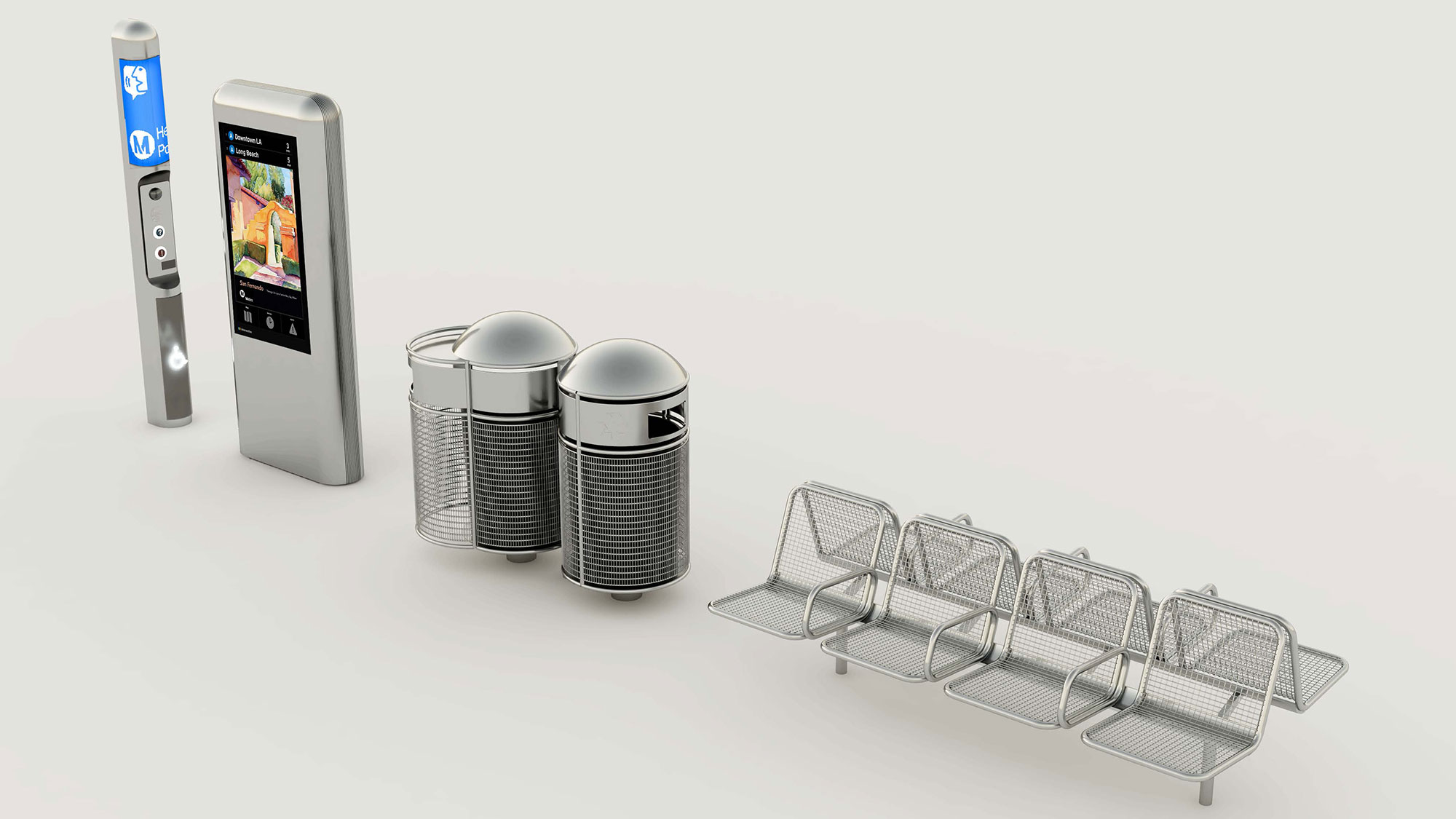
Designs for the station furnishings required a balance between the demands of this high use/high abuse environment and the desire for a simple, minimal, clean, and modern design aesthetic. A singular form, material, and finish for the furnishings, along with common placement within each station, creates a coherent design narrative across the system.
For seating, armrests are used in between seats but not at the ends. This helps assist passengers who desire them and prevents people from lying down, while also allowing free access to the end seats. A stainless-steel mesh seat and back provides durability with comfort, allows for dirt and liquids to pass through easily and creates increased transparency around the train platform for better security.
Waste receptacles have small openings to discourage scavenging and no door flaps, which users prefer not to touch. Side access, in lieu of removing waste from the top, reduces back stress on maintenance staff and a stainless-steel mesh is used for transparency and security.
All station elements, including seating, waste receptacles, display panels, and other station equipment, were designed with a slightly rounded profile to provide a unified look, while also serving the practical purpose of minimizing dirt, precluding birds from roosting, and preventing trash and other items from being left on the elements. All elements attach to the floor with a minimal number of contact points to clean around them more easily, create greater visibility for safety and security, and for fewer patch points when equipment is moved. A stainless-steel material with brushed finish was chosen for most of the amenities not only for durability, but also for a clean, modern aesthetic.
There are many reasons that deter people from using public transportation — from safety, to cleanliness, to the difficulty of navigating stations. Through simple, creative, and thoughtful design solutions, these issues can be overcome to provide a quality rider experience. Using design to help find solutions to increasing ridership and pride in our public transportation networks is imperative in getting our future cities right — and is all the more important as the world’s population continues to migrate to our urban centers.
Through an execution of a minimal pallet of cohesive materials and an integrated and streamlined design of fixtures and furnishings, a safe and maintainable public space can also evoke a timeless and serene atmosphere — projecting a modern aesthetic that will holistically define and distinctively identify LA Metro.
For media inquiries, email .

