What Workplace Can Learn From Airports
August 08, 2022 | By Melissa Mizell
Over the past two years, much has changed in how we navigate the new model of hybrid work. The office as we knew it wasn’t working for us and was ripe for reinvention. Employers are now looking to the office as a means of bringing people together and building or strengthening relationships. The office should be a destination, not an obligation — a place where people want to be. As such, we’ve been looking at non-office models and have been exploring how those experiences could be applied to workplace. One of these areas is aviation design. The best airports put a hyper focus on the passenger experience, so what if we leveraged the same lessons from the best in aviation design to enhance the workplace?
Here are five lessons from aviation design to create a more seamless, equitable workplace experience:
1. Navigating the workplace journey
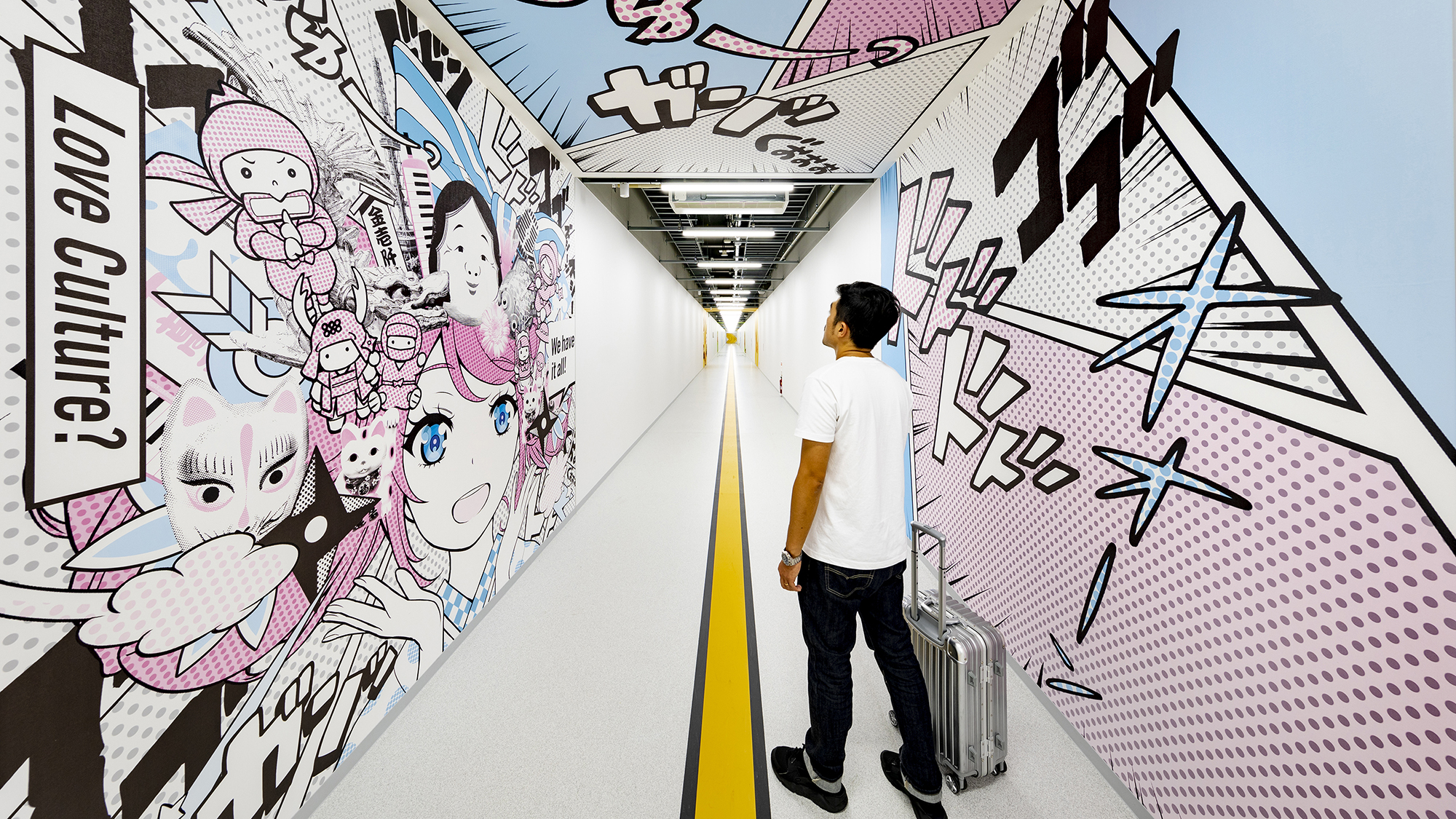
A person’s journey through an airport is a fairly linear experience. You’re either taking off to some place or you’re arriving. It might be your first impression of a new city. We spend a lot of time tracking those journeys and really curating them. In an airport, every moment matters. What if we thought more deeply about the workplace journey? During the pandemic, as we were predicting what might happen when we return to the office, we were thinking about journeys that would keep us safe: directional one-way arrows on floors, hand washing stations, and 6’ radiuses. Because workplace journeys are not completely linear, it’s hard to highly curate them — but what if, as with airports, we think about workplace journeys that are punctuated with moments of surprise and delight?
And what if these moments are always changing, so we keep people engaged and wanting to come back? Providing moments of health and well-being, education, and art are ways that airports attract passengers to come early and spend time. Just as airports have learned much from retail (pop-ups!) and great hotel design, workplaces can also borrow strategies from these industries to keep experiences fresh.

2. Celebrating thresholds
One inescapable fact of life with airports is they’re all about layers of security, which we experience as series of thresholds. The threshold between gate lounge and jet bridge, the approach into security as you mentally prepare (or hastily unload your water bottle), and most importantly, the threshold that you come to after you make it through security. We call this “recompose” and it’s a moment of celebration — you’ve made it through! Now time is yours, how do you want to spend it? What if we thought more about the thresholds in our office spaces — the first one being the threshold of the lobby? Beyond being the formal introduction to a company’s brand, this is a chance to shed the outside world, an opportunity for guests and employees to get excited and to prepare for their own journey in the workplace. There are other thresholds within the office that deserve more consideration — thresholds between socializing and focusing, between coming out of a meeting and going back to your desk — these are potential places to pause and reflect.
3. Evolving the third place
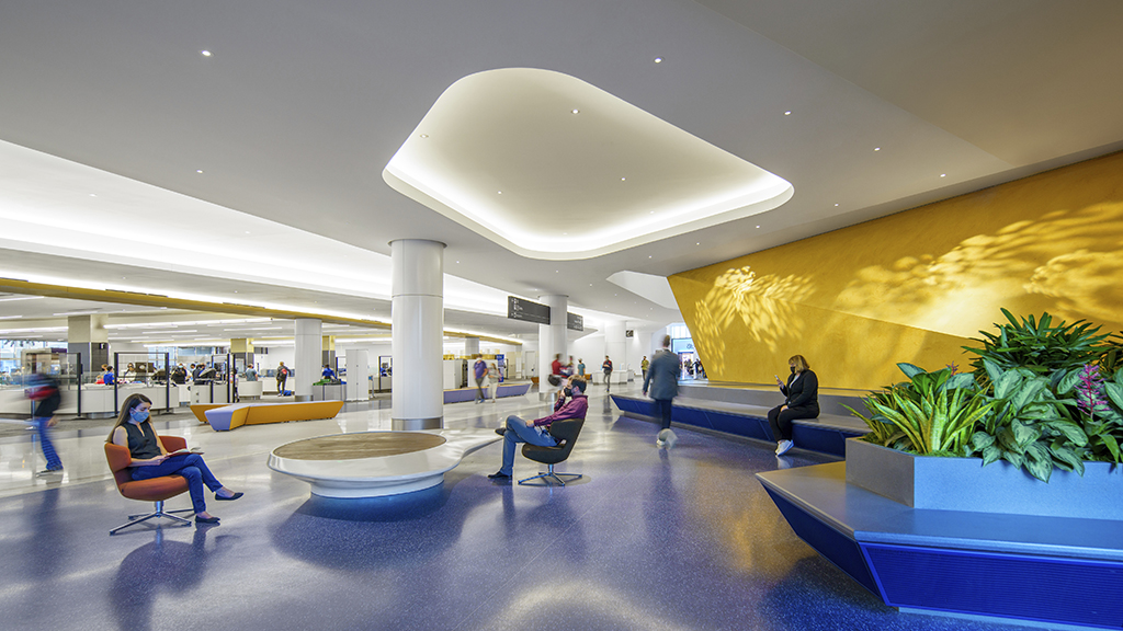
Since so much of a traveler’s airport experience is about waiting, airport designers strive for dwell spaces that provide a productive wait time. These spaces are no longer just a sea of tandem bench seating, but ones that anticipate a wide range of needs with a variety of seating and postures. There are places to plug in, places to perch, and places to sit comfortably. Places for prospect and refuge — having your back protected but being able to people watch (which is one of the coolest things about being in a big public space). In this way, waiting spaces become really great third places — all within easy reach of great coffee and dining. We are hearing more and more from people who say they come to the airport early to get work done before their trip. But productive wait time for travelers must accommodate a wider variety of ages, activities, and states of mind, requiring more options to be on offer.
4. Expanding choice
Providing choice and variety in the workplace is already a hallmark of progressive design. What if we broadened our views beyond noisy and quiet, and extroverts and introverts, and considered a deeper understanding of neurodiversity or even changing needs throughout the day? This might mean planning for an even larger variety of settings: active, stimulating, calm, protected. It’s about really, truly, allowing for people of different abilities to thrive in our workspace.
5. Look up!
One of the things that really stands out for me in aviation design is how much attention is put into the ceiling. It becomes an effective, intuitive wayfinding device, and enhances the journey when we treat different areas in unique ways. We use the ceiling plane and adjacent surfaces to bring in daylighting to make the experience feel airy and bring a sense of delight. Perhaps for workplace a differentiator in today’s market is how the next speculative office tower might build a higher ceiling to allow for more variation and expression.
As we continue to innovate our spaces and experiences, it’s important to keep in mind that the experiences and needs people — whether employees, passengers, customers, etc. — are looking for have shifted. Just as we learned when our world turned upside down, we need to continue to be open minded and question everything, be ready for anything, and understand that tomorrow may be a very, very, different day.
For media inquiries, email .

