Designing an Inclusive, Effective All-Gender Restroom Symbol
By Nick Ross
As designers, we’re always trying to embrace and understand shifts in modern society. One consistent example we encounter is managing identification signage for toilet facilities, specifically the all-gender restroom. Without an existing standard, properly identifying these restrooms in signage and wayfinding through use of an effective symbol is crucial; however, designing a symbol for an all-gender restroom can be a potentially contentious conversation, inviting input and commentary from many viewpoints. There’s a myriad of user groups, and some are fiercely protective of their identity and how they’re represented. In designing an effective, inclusive symbol for all-gender restrooms, we found that building empathy and respectfully engaging user communities is critical to success.
In 2016, as part of an ongoing terminal expansion project, San Francisco International Airport engaged the Gensler San Francisco office to design and implement a symbol for their newly deployed, all-gender restrooms. These are large, multi-stall restrooms with a communal sink area and individual floor-to-ceiling stalls. A setting like an international airport creates a particular challenge for wayfinding symbol design. The symbol must be highly legible — it must be capable of being quickly and clearly read from many different distances and heights. The traveler in an international airport may not be able to read English (or read at all, for that matter), and so the symbol must also be universally-understood and be able to stand alone without text-based messaging reinforcement. An effective visual symbol should be the designer’s main concern.
We began the design process by gathering all the precedent symbols and messaging we could find. We conducted an initial focus group made of a diverse population of all-gender restroom users, including families/parents of young children, caregivers/those needing assistance in restrooms, and LGBTQ+ folks. Participants were asked to select which precedent symbols and messaging they preferred and those they didn’t — or they could draw and write in their own solutions. This was a passive focus group. Symbols and messaging options were presented in a communal space over a 24-hour period. Respondents could give feedback at their leisure and without constant observance from our design team, and the results were later gathered for analysis.

In a second focus group, we wanted to hear directly from the users who tend to draw the most attention in discussions around all-gender restrooms. Our design team worked with a group of approximately 30 transgender people, asking them to select which precedent symbols and messaging they preferred and those they didn’t. By respectfully soliciting and listening to the community’s input, the second focus group became an empathy-building exercise for our design team.
These users' main concern was safety. Nearly everyone in the group reported feeling intimidated or experiencing hostility — and in some cases actual violence — when using a restroom. Some felt that the symbol associated with an all-gender restroom can sometimes single them out or identify the user as a target, impacting their sense of security and potentially their well-being. Our group also felt that the symbol should communicate a sense of inclusion — in other words, it should be as neutral as possible, and no one should feel excluded or judged by it. Additionally, the new symbol should feel equal in visual treatment to those of traditional men’s and women’s restrooms, which are often located near all-gender facilities.
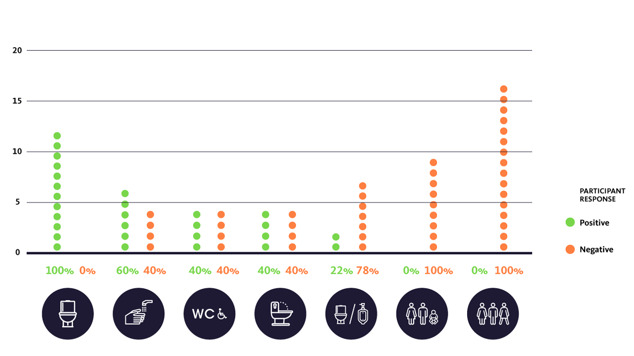
Through our discussions, we found that the vast majority of transgender users believed that the symbol for a universal restroom should simply portray the fixtures or equipment inside the restroom — and leave out potentially confusing gender markers or representation out of the equation. Similarly, the group greatly preferred a simple message such as “Restroom” or “Toilet” over the lengthy “This restroom may be used by anyone regardless of gender identity or expression,” message supplied by many off-the-shelf signage vendors.

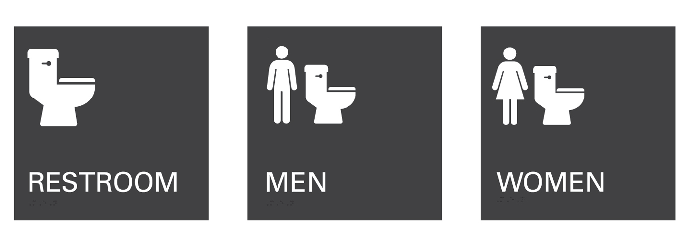
As a result of these findings, we developed a simple graphic representation of a toilet paired with the text identifier “Restroom.” In the spirit of equality that emerged from the focus groups, we revised the traditional gendered restroom symbol by pairing the toilet symbol with the historical men and women symbols — in effect identifying the gendered restrooms as the ones with certain identification requirements, instead of the all-gender restroom.

